I started fraction.work earlier this summer, based on my experiences as a fractional software developer earlier in my career, and my experience hiring fractional developers while running HiddenLevers.
Those experiences guide me to believe that there’s a huge market for long-term, part-time software development work (that’s how I define “fractional” software development). We’ve seen fractional CFOs, CMOs, and GCs, but the adoption of this approach has been much slower at the individual contributor level and in particular in technology roles.
This is ironic because software development is more amenable to remote work than any other role – witness the explosive wave of offshore and nearshore development since the pandemic normalized remote work! Employers oddly feel more comfortable working with someone who half a world away and who may not grasp nuances of cultural difference, than working with someone in the US who is available 30 hours a week?
I know this isn’t really true – but many companies have a mental block when it comes to part-time work. As part of normalizing how effective it can be, I detailed the experience on the fraction.work blog – I hope you’ll follow the story there!
Uvalde, Buffalo, Parkland – the common thread in these massacres? All were committed by under-21 boys who purchased their guns legally. In mass shootings, 77% of the murderers obtained their weapons legally! Over 17% of all homicides are committed by those 18-20, and most weapons used in crime are obtained legally or through straw-man purchases from legal sellers [1].
So you’re telling me we could reduce school shootings and potentially stop 4000 deaths per year, just by making kids wait until they are drinking age to buy a gun [1]? It’s not quite that simple – with America awash in guns, eliminating access wouldn’t stop perpetrators entirely. But it’s worth noting that the aforementioned trio of shooters didn’t have criminal records, and didn’t have criminal contacts on whom to rely for illicit weapons. If only 1 in 4 young adults were stopped from obtaining a firearm, this would reduce deaths by over a thousand per year. From a gun-rights perspective, no right has been taken away – just shifted a few years to enable young minds to develop and gain impulse control (brain development actually ends at 25).
Most reasonable gun safety measures are supported by the majority of Americans, but this particular improvement was also enacted by a conservative state – Florida ended gun sales to the under-21 crowd after the Parkland shooting. If Florida can do it, then virtually every state politically to the left of FL should be able to make this change. Narrow Federal legislation in this regard might be possible (though unlikely) in the current moment [2]. As this latest tragedy focuses our attention on the issue, I hope politicians will focus on simple, attainable changes like these.
[1] The FBI data uses slightly different age ranges, but if we add 1/5th of the homicides committed by those 20-24 to homicides committed by older teenagers, we get 1910 homicides in 2019 – this is 17% of all homicides that year (where age of offender is known). When scaled to 2021 homicide levels (using 6.9 per 100k rate and Census 2021 population), this is 3893 homicides per year – 79% of which are estimated to be committed by firearms. That’s 3110 homicides per year. Using CDC data we find another 900 suicides by firearm within the 18-20 age group – for a total of 4000 deaths per year!
[2] Theoretically this should be easy to pass at the federal level, but Congress has become so ossified and reactionary that nothing will pass there.The guns-at-all-costs crowd has grown more extreme, with many calling for ALL weapons to be legal (yep that includes nuclear weapons, according to a former TX state representative).
The US needs workers. Millions of workers. The need existed pre-pandemic, but has reached a crescendo now, with a record number of job openings (11.5M vs 7M pre-pandemic) and almost 2 jobs available for every unemployed worker. The roots of this problem run deep – contrary to the typical media narrative, pandemic-era retirements and immigration shutdowns have created much of the current situation. But some industries were near shortage in 2019, before the pandemic turned life upside down.
Software is one of those industries – in recent months recruiters have resorted to more and more desperate measures to acquire talent. The industry lately feels a bit like a merry-go-round for HR departments, as they push harder and harder, only to find they are just spinning in place as one developer joins and another one goes. This zero-sum recruitment game can’t be fixed with better recruiting practices, or better HR platforms, or better retention strategies. Just like the housing market, supply is the only fix! Enter gig platforms like TopTal and remote work platforms to encourage offshore team building. Those help, but each comes with its own set of challenges – how do you continue to build your core US team when there just aren’t enough workers?
When I built HiddenLevers, I made a pointed decision to bootstrap – so we had no room to waste capital. We began hiring developers on a half-time basis, while letting them retain their full-time jobs (prior to HL I did side contracts as a developer for years, so this was a natural step for me). This turned into a huge win-win: we got access to senior developers with capacity, and they monetized their free time without the hassle of constantly switching gigs. About a third of our development team was halftime over a decade, with a zero turnover rate (several of them switched their day jobs but stuck with us throughout).
Fast-forward to the present – as an entrepreneur considering what’s next, it occurred to me that this model could work at scale. Based on our research, half a million developers could take on halftime work [1]. Adding the equivalent of 250k developers to the US workforce would fill 60% of expected demand [2]. And of course this doesn’t just apply to developers – millions of Americans in other professional jobs could participate, filling huge gaps in the US workforce. I’m excited to start down this road, with a mission of normalizing the idea of working 0.5, 1, or 1.5 jobs in the professional world. This kind of flexibility will empower the workforce and help solve labor shortages in the years ahead. Hit me on LinkedIn, at praveen at halftimer.co, or via our site to learn more!
[1] There are almost 5M Americans employed in “Computer and Mathematical” positions, with adjacent fields like UI/UX design and product management swelling the numbers further. In interviews with hundreds of developers, we’ve found that almost 40% are interested in halftime positions (in addition to full-time work). Our screening and interview process has shown that about 1/3 of interested developers have the combination of technical and self-management skills needed to be effective as a halftimer. Based on these metrics, there may be a qualified pool of 500,000 halftimers across the United States.
[2] According the the Bureau of Labor Statistics, over 400,000 additional software developers will be needed by 2030 – 60% of this could be covered by tapping the spare capacity of the existing workforce via halftimers!
How does a bootstrapped exit compare to a VC exit, from a founder’s perspective?
TL;DR A VC-backed company will have to exit for 4-10x the valuation of a bootstrapped company, if the founders are to have an equivalent payout.
The above infographic (click to see the full version) does an excellent job illustrating the general stages of the startup company life cycle, except that most end in failure or acquisition rather than IPO. The percentages on the original graphic are dated and I’ve updated them above. The general point remains – each capital raise reduces founder equity in return for powering future growth. But the actual math matters – let’s take a look at some sharper numbers:
A typical VC-backed startup goes through four rounds prior to exit, where founders’ equity is reduced by 15, 25, 25, and 25%, with another 5 points lost to the options pool shuffle, advisors, board members, and other hangers-on. The four rounds are the seed round, Series A, B, and C.
The options pool shuffle is a clever trick VCs employ to capture a bit more equity. Advisors and board members often command 0.5 to 1% of the company each as well.
The compound impact of this at exit: founders’ + employees’ equity at exit totals 30% (a range of 20-40%). If we assume 2% in exit transaction fees and 8% fully diluted to employees, that’s 20% to the founders at exit.
Using the same assumptions, a 100% bootstrapped company has only the final 10% in exit transaction fees and employee compensation, leaving 90% to the founders.
The math above is daunting: 90% vs 20%! This tells us that founders should go the traditional VC route if they believe that it will enable them to exit at least 4-5x larger than the size of a bootstrapped exit. I’ve validated these basic numbers in conversations with a number of founders, and while the particulars will vary, the general guidance holds. Many founders give up too much, and end up as low as 5% at exit.
This assumes that your company can get somewhere without funding, which may not be realistic.
Bootstrappers trade time for money to an extent, if growth is ever constrained by lack of funding.
When choosing whether (or how much) to raise, consider your total addressable market. If you’re in a profitable niche, bootstrapping may be optimal. If your TAM is greater than $10B, go raise money.
There’s an intermediate option – raise, but raise wisely. Bootstrap your MVP, raise after you’ve got something repeatable, and raise all you can that one time. If (and when) I do it again, I’ll strongly consider this option.
Here’s a sample of Real-Life Exits:
GrubHub founders Mike Evans and Matt Maloney each held about 2.6% of GRUB at IPO – this degree of dilution is unfortunately common.
At the other extreme, David Barrett owned 47.7% of Expensify at IPO – proving that with judicious use of capital, dilution doesn’t have to be extreme.
The founders of Toast (TOST) collectively owned about 17% of the company at IPO. This was worth $5.1B at IPO, but has fallen 70% since, with share lockups preventing a true exit.
Mailchimp was the king of bootstrapped startups, going from 0 to $12.3B at acquisition, and succeeding in a space while competing against startups equipped with $100M+ in funding. Had the Mailchimp founders’ ownership been similar to Toast, Mailchimp would have had to sell for $74B to net the same founder outcome!
Private exit data is harder to come by, but Riskalyze saw the founder and CEO holding roughly 16% at exit to private equity (this was not a complete exit, as the PE firm bought a majority stake but kept the team onboard).
Why HiddenLevers Never Raised Capital
When I startedHiddenLevers and roped inmy cofounder Raj in late 2009, we talked about what success looked like. We thought success would be running the company for a year and selling it for … two million. We thought we could demo our cool new portfolio stress testing technology to major brokerages and just have one of them snap it up! Naive – but also a comical underestimate of the value we could create.
It took us about a year to reach a semblance of product market fit, which occurred when we found the RIA space – independent financial advisors understood the value of using HiddenLevers for their end clients. Over the course of 2010 we had been researching addressable markets, and one thing I’m proud of is the quality of the TAM modeling we did at that time. A decade later it was still essentially accurate – we were in a highly profitable niche space, with several hundred million in total addressable market for the financial advisory space. Here’s the spreadsheet from September 2010 – row 12 is where the business ended up thriving.
We looked at that TAM and worked top down and bottom up – from the bottoms-up perspective, we set a make or break goal of 100 clients by July 4th 2011 or we would fail fast and shut down. From the top down perspective, I calculated – what kind of business value results from capturing one percent of this audience?
Looking at the business from both perspectives, a few things became clear:
We were able to use trade shows, email marketing, adwords, and press coverage to grow profitably, and it wasn’t clear that investor capital solved a problem – we had free cash flow to reinvest.
If we did raise capital, the scale of our addressable market damaged our chances of a successful founder exit – diluting your stake works if it’s in pursuit of a massive market, but poorly in a niche.
Successful expansion outside our niche might require capital, but growth within it did not.
In 2020 we reached an inflection point – to sustain our growth, perhaps it was time to finally raise a round so that we could expand upmarket, build out an enterprise sales team, etc? It was this inflection point that caused us to reach out to the M+A market – the early growth phase of the company was complete, and we felt that it was better to join forces with a more mature organization than to try to build that organization ourselves.
For a business like HiddenLevers, bootstrapping fit perfectly. The math I outlined up top held up well, and it’s quite possible that taking capital would have actually hurt our exit outcome. But if I ever try to build something to conquer a big market (over $10B TAM), I’ll do it the “normal” way – with investors.
I just wrote about a detailed calculation of COVID deaths and their potential electoral impact in Georgia, my home state. One factor that causes COVID deaths to have little political impact in Georgia: the state has a large black population which is disproportionately impacted by COVID, and this balances out deaths (politically speaking) among the older white population.
What about if we look at a swing state like Wisconsin, which is 87% white per the Census Bureau?
This ought to mean that COVID would push the Wisconsin electorate leftward, correct?
Here are 2020 exit poll results for white voters in Wisconsin, and 2020 exit poll results for black voters in the Midwest (black Wisconsin voters weren’t available as a subset):
President Biden won Wisconsin precisely because he lost the older white vote by a relatively small margin.
Let’s do some simple math:
8064 deaths * 86.5% white = 6975 deaths
6975 deaths * (10% Trump margin amongst age groups at risk) = 698 net loss in Trump voters
8064 deaths * 7.7% black = 621 deaths
621 deaths * (62% Biden margin among black voters in Midwest) = 385 net loss in Biden voters
The Wisconsin GOP appears to have lost 300-350 net votes due to COVID thus far. It’s possible that this understates the impact, since the white voters that died post vaccine-era are increasingly represented by GOP voters (since they are more likely to refuse vaccination). But 80% of COVID deaths in Wisconsin occurred prior to general vaccine availability (prior to 1/31/21), lowering partisan effects due to vaccine hesitancy. Even if we assume a 20% Trump margin among white voters that died post 1/31, this only increases the GOP’s net vote loss to 500 votes (add 1/5th of the white vote * additional 10% margin).
The impact of a 500 vote swing could be meaningful in states where politics is a game of inches these days – but we can’t overstate it. Voters’ overall reaction to how the pandemic has been handled is by far the larger factor in how COVID impacts American politics.
I decided to try cross-referencing two data sources in Georgia to see how COVID might have changed the electorate. Given that President Biden won GA by only 12,000 votes, here, even small shifts in the electorate could have meaningful results. The Georgia Department of Public Health breaks COVID deaths down by age and race, and 2020 exit polling data provides a (rough) guide to how different demographics voted.
We can do some simple math to gauge the impacts, weighting the deaths by Biden/Trump voting split to determine the total impact on the Red/Blue dynamic. Here is 2020 exit polling data by age and race from CNN – since black and white were the only racial categories measured, we’ll focus on these (the number of COVID deaths in other groups in GA is dwarfed by these two groups).
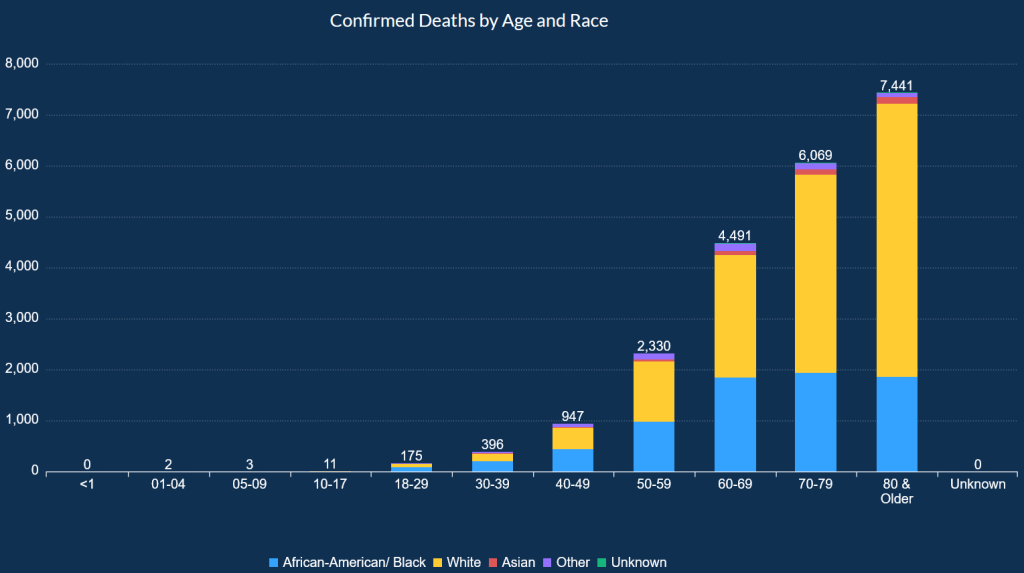
From the Georgia Dept. of Public Health, here are COVID deaths by race:
In absolute terms, the number of white deaths greatly exceeds all other groups, principally because the vast majority of Georgians (and Americans) over 70 are white.
Now let’s do the math. We’ll use a simple model – we’re just using the age groups by race, and the voting margins by age and race, to determine how many votes each side has likely lost due to death by COVID. COVID has resulted in substantial excess mortality in the US since March 2020, so most of these people would still be alive and voting. Here’s the spreadsheet.
Results:
GOP candidates are likely to lose 4,661 votes due to COVID deaths.
Democratic candidates are likely to lose 4,895 votes due to COVID deaths.
This leads to a swing of 234 votes in the GOP’s favor. This result is influenced by a few factors:
While white deaths do substantially exceed black deaths in total, the black population of Georgia is experiencing substantial excess mortality – total deaths of black Georgians exceed that of white Georgians for ages 18-49, despite being roughly 1/3 of the population in that age group.
Biden won Georgia by chipping away at Trump’s margin among white voters – while older black voters favored Biden 94-6, older white voters favored Trump by 72-28. Since COVID mortality is centered on the elderly, the lopsided voting patterns help cushion the GOP’s losses.
My prior assumption, when glancing at the Georgia Dept of Public Health graphs, was that COVID might have a non-trivial impact on GOP support, simply given the large number of deaths among older white voters. This analysis has ignored differential vaccination rates by political leaning – so it’s possible that going forward, this calculus might change, since conservatives appear most vaccine resistant. In Georgia at least, it appears that COVID deaths are not leading to much net change in the electorate. States with a more homogeneous white population might experience a more profound impact, since age would then be the only important variable.
I’m no epidemiologist, but it occurred to me that there might be a silver lining with the COVID-19 Delta variant.
Delta is explosively contagious, with an R0 between 6 and 9. This means that the average infected individual is expected to transmit Delta to 6 and 9 additional people (versus 2.5 for COVID-19).
This means that it just rips through populations. Because it can be transmitted by the vaccinated, it can travel deeper across the population as well.
But so far is has not been found to be more lethal than the original, except to the extent that it crushes hospital capacity with its surge.
Think about the virus’ evolutionary goals. It doesn’t actually care whether people live or die – the variant that spreads best dominates. If Delta manages that, while letting the vaccinated largely be unharmed, then it could become the pandemic’s endpoint.
Why? Delta might crowd out new variants if it gets around and becomes the primary endemic version. To defeat Delta and take its dominant position, the next variant would have to be even better at spreading.
Of course that is possible, but if Delta already can be spread by the vaccinated, it’s possible that is has already maximized the population growth prospects for this kind of virus in humans. The vaccinated can carry a Delta population in their nose without realizing it.
Ironically, if any current vaccine were perfect, it would leave an attack surface for the next variant – conquer the vaccine. Perhaps the optimal vaccine simply allows us to live with the Coronavirus and welcome it to the family of standard household colds?
And so perhaps Delta has evolved to be well suited to our current vaccines, able to maximize its reproduction. If we are lucky, it will crowd out any more lethal strains – marking the beginning of the end of the pandemic. There’s some indication that this might be happening, as Lambda has been present for some time, but has yet to grow in the US to extent that Delta has.
This all assumes that vaccination efforts eventually meet with success and cover the overwhelming majority of the human population.
This could be wishful thinking – new variants will either validate or make a mockery of it soon. But the explosive growth and subsequent subsidence in COVID Delta cases in the UK and India give me room for hope!
Over a decade ago, I wrote a post ranking major metro areas by cost effectiveness. Both median income and cost of living vary by city – an easy metric on cost effectiveness can be derived by simply dividing income by a measure of costs. I decided to reprise this study, but after finding the original data sources unavailable, chose to construct a new measure using median income divided by home price index for each metro [1].
Why home prices? As home prices have risen across many metropolitan areas in the US, housing costs are eating a larger share of household income than measured by CPI or many cost-of-living-indices. In addition, home prices (and the rents they imply) have proven to be a key impediment to household formation in expensive areas – witness the outflows from California now that the pandemic has severed the ties between location and employment!
Chicago tops the list in this analysis, driven by above-average median income coupled with the lowest home prices in the top 10 US metro areas. While Detroit is next (another vote for low home prices), it’s followed by San Francisco, Minneapolis, and Boston, all metro areas where above-average income offsets higher home prices. At the other extreme, Miami keeps its spot at the bottom, with high home prices and low median incomes. The bottom five is rounded out by Tampa, Los Angeles, San Antonio, and Orlando.
Clearly your mileage WILL vary [2] – while homes are cheaper off the coasts, it’s not yet clear if 100% remote work will continue to be possible for those who are able to take advantage today. Nor does this analysis account for income inequality within cities, as your income in city X might vary substantially more than in the relative comparisons below. Nonetheless, if you can tolerate the weather, it seems that Chicago and Detroit want folks back, and if need to be in the Sun Belt, Atlanta is the top option. If you need a beach, you’ve got to head down the list, where San Diego is the best bet.
[1] This is an overly simplistic measure to be sure – in reality you’d want to consider the net disposable income per household after factoring in wages, federal/state/local taxes, home prices, and other expenses, as adjusted by metro. In the pandemic world, perhaps it’s possible to take your job anywhere, in which only cost factors are impactful – but in the long run, it’s likely that local salaries will matter, whether because employers bring employees back to the office or because they begin to adjust salaries by location.
[2] NerdWallet, Best Places and others offer more detailed city vs city calculators, some of which enable tweaking of personal circumstances as well.
Analysis of all 2019 US police homicides indicates that half are not justified – over 500 individuals per year die unnecessarily at the hands of police.
In 2019, police in the United States killed 1,099 people – and US police are tracking toward 1150 for all of 2020 [1]. While there is no uniform government database for police homicides in the United States, non-profit efforts like Mapping Police Violence have emerged to track the issue. While great work has been done collecting data, I’ve seen no analysis as to whether the homicides are justified. At one extreme, police unions argue that the police are always right – they believe that police homicides have a nearly 100% justified rate. BLM protesters and others argue the opposite – but where does the truth lie? If all police violence were justified, then there’s no reason for concern. As hundreds of videos and photos now show, it appears that the fraction is much lower – necessitating this analysis.
I analyzed fifty 2019 police homicides by hand, reading media reports, reviewing video evidence, and reading police reports. All 1,099 police homicides in 2019 were then analyzed using an automated approach – see the spreadsheet at bottom for the full details [2]. I used calendar year 2019 data, and manually scored 50 homicides using a list of rules as follows:
Rules Used in Manual Scoring: (51% of police homicides determined to be justified using these rules)
Was the deceased provably (video, non-police witnesses) attacking officers or a victim with a firearm? If so, set to 100% justified
Did the deceased kill anyone else prior to or during police intervention? If so, set to 100% to justified
Was the deceased armed with a firearm or knife? If so, add 25% to the probability. (Cars, tools, and other implements are not counted here)
According to the police, was the deceased threatening the police or a victim with a weapon? Is so, add 25% to the probability.
According to non-police witnesses or footage, was the deceased threatening the police or a victim with a weapon? If so, add 25% to the probability
Was the deceased shot in the back, while running away, or while driving away? If so, set the probability to 0%. (Shooting at drivers in cars has been proven to be extremely dangerous to the public and to officers, and is outlawed in many countries)
For the automated data analysis, I used only data available within the Mapping Police Violence spreadsheet.
Rules Used in Automated Scoring: (54% of police homicides determined to be justified using these rules, with all data per police reports)
Was the deceased armed in any fashion? If so, add 25% to the probability.
Was the alleged weapon a firearm? If so, add 25% to the probability.
Was the deceased attacking the police or others at the moment they used lethal force? If so, add 25% to the probability.
Was the deceased holding their ground and not fleeing? If so, add 25% to the probability.
Was the deceased fleeing at the moment the police used lethal force, whether by car, foot, or other means? If so, subtract 25% from the probability.
Did the deceased exhibit symptoms of mental illness? If so, subtract 25% from the probability.
Both analyses show that roughly half of all police homicides were found to be justified. When reading through and scoring individual homicides, I noted a wide range of cases ranging from truly heroic action to absurd and ridiculous [3]:
Heroic: Killing active assailants engaged in firing on officers or the public
Dubious: Shooting suspects in the back or in a car while they were trying to run away or drive away, even when they posed no threat
Absurd: A mentally ill person called 911 too many times, resulting in 911 dispatching officers to arrest him for excess calling, leading to his death unarmed and in his own home, after struggling with police
If half of all police homicides are not justified, then police are responsible for over 500 preventable deaths per year. This result cries out for change, even before potential racial inequities are studied! For those who think the police deserve the benefit of the doubt – the numbers indicate that the problem is real, and needs real attention. For those who think the police are always wrong – there are hundreds of instances in 2019 where the police rightly used lethal force. As usual in America these days, the solution is not binary – we need to acknowledge this and take reform seriously, but not to absurdity.
[1] Through August 24th 2020, policed had killed 751 people, according to Mapping Police Violence – that’s through the first 237 days of the year. Multiplying by 365 / 237 to normalize for a full year yields a rate of 1157 homicides per year for 2020 thus far.
[3] It’s important to note that the vast majority of the data for this analysis comes directly from the police. By 2019 anti-police violence protests movements had already gained traction across much of the country, leading police departments to proactivelyprovideevidence when shootings are justified. When a police department refuses to comment or provide evidence on a shooting, the innocent-until-proven-guilty standard should be applied, meaning that the justification percentage is 0% in the absence of evidence.
Should the Federal Reserve provide liquidity via bank deposits for all Americans instead QE?
The purpose of quantitative easing is to lower interest rates, inject liquidity into the economy, and prevent the collapse of financial markets. It’s the ultimate top down approach to the problem – funnel money into too-big-to-fail financial institutions, and hope that this settles the market’s nerves and trickles down into the real economy.
In a sense, quantitative easing is the ultimate form of trickle down economics – inject money into the wealthiest parts of the economy to keep them wealthy during a downturn, and hope that this trickles down to Main Street.
During the 2020 COVID19 pandemic the Fed has taken a broader view of its powers than ever before, instituting over a dozen new programs in record time. The Federal Reserve balance sheet hit $7 trillion in 2020, far exceeding total Fed intervention in the financial crisis, and unleashed at unprecedented speed. This has stabilized the stock market, with essentially zero downside for the year after a sharp tumble and equally sharp recovery from February to April. The Fed made this recovery possible by pledging to buy unlimited quantities of securities, and for the first time stepped into multiple new roles, buying individual bonds, buying ETFs, creating a Main Street lending program, and more.
All of this begs the question – why not dispense with all the hijinks and provide liquidity directly to the people, where it’s much more likely to be utilized within the real economy? Various proposals like Andrew Yang’s freedom dividend and others peg the cost of providing $1000/month to American adults at around $2T per year. If the Fed were to engage in such a program, how might it work, and what are the potential benefits and risks?
Potential Structure of a Federal Reserve-Funded Basic Income:
The Fed would offer funding for deposits at 0% interest to the banks.
Any bank that deposited these funds in equal amounts in every individual account at the bank would receive a 10bp servicing fee for providing this service. The bank would also not be required to repay these funds to the Federal Reserve.
The total amount offered to a bank would be dependent on the number of individual customers served by the bank.
Safeguards would have to be established to ensure that individuals with accounts at multiple banks only received funds once.
Potential Benefits of the Program
Given that individuals have a much higher marginal propensity to consume than banks or corporations, these funds would get spent, thus powering the real economy and GDP growth
Banks would be empowered to lend against the deposits on their balance sheet – this is the opposite of what’s happening with reserves that banks have parked at the Fed earning interest
The Federal Reserve would still have QE and control of the yield curve in its toolbox, but could use these tools much less, which would result in more normal interest rates across the yield curve.
Potential Risks and Downsides
Inflation is the principle risk of such a program – give the people money, and inflation will run wild – right? A basic income of about $500/month would cost $1T per year – this is the same rate of money supply expansion since 2008. The Fed could also use higher interest rates to keep overall money supply growth in check.
The Federal Reserve could simply swap this form of money supply expansion for its current use of QE. But individuals might expect this to be a stable, recurring payment – would this rob the Fed of flexibility?
Now that the Federal Reserve has opened Pandora’s box with numerous programs not codified within its charter, it’s time to reexamine a fundamental premise – are these the best ways to inject liquidity into banks? Or should the Fed put the reserves in checking deposits at banks? This serves a dual purpose of both capitalizing the bank and the public at the same time, and with a direct and dramatic impact on the economy. It may sound like heresy, but the ZIRP alternative was not exactly showing great economic growth prospects even prior to the pandemic.
The US is the world leader in innovation – can the Fed break out of the box and consider a program to help all Americans?


