Coronavirus: Why the US Might Fare Better than Expected

Update 5/31/2020 – It’s been two months exactly since this post. Some aspects have aged well – US deaths to date did in fact peak around 2500 per day, and the rate of death has declined substantially since. The notion that we’d stay below 100k deaths overall has not, however. I believed that the opportunity created by April shutdowns would be used to ramp testing 10x, and that mask usage might dramatically increase. It now appears that the US is instead focusing on a vaccine as the only solution, with ongoing deaths the price paid for an unwillingness to wear masks or test aggressively.

Original Post – 3/31/2020

With the steady drumbeat of negative news, it’s easy to slip into despair about the state of the nation and the world. The present moment has enabled journalists and well-meaning prognosticators of all sorts to shout out the depth of our peril. While the danger is real, I’d like to take a moment to point out a myriad of reasons why the Coronavirus pandemic may end in something less than the worst case outcome (for the skeptical, you will find ample sourcing along the way).

First, let me define what I mean: a worst case outcome would be something approximating the Imperial College of London study, with millions of deaths in the United States. While President Trump initially stalled and downplayed the crisis, the response is now rolling nationwide, with 75% of the US under lockdown and 90% of Americans saying that they are staying home in some manner. If the US manages to traverse a path similar to that of Italy, we might keep total fatalities at or below 100,000.

Italy Coronavirus Status as of 3/30/2020:

Italy entered a nationwide lockdown on March 9th, and the positive results of this action have become evident over the last 10 days (roughly two weeks after lockdown). Worldometer’s Coronavirus charts tell a striking story – new Coronavirus cases as of March 30th are below that of March 19th, and total daily deaths remain below the peak set on March 27th. While the trend could yet reverse, this follows the path set by China  in which strong lockdown measures resulted in a drop in new cases a bit under two weeks later. If Italy’s trends continue, coronavirus should become less lethal in the country once the curve is sufficiently flattened and hospital capacity is again able to deal with all critically ill patients.

US Favorable Metrics Relative to Italy (and China):

The US has the dubious distinction of having the world’s most Coronavirus cases, but we also have quite a few factors working in our favor. Let’s walk through each and then apply an Italy-style scenario to the US:

  1. The population density for the lower 48 is roughly 329M / 3.1m sq miles = 106 people/sq mile, versus 533 people / sq mile in Italy. This is not a linear factor as populations are grouped into much denser metro areas, but in general metro area density in the US is still much lower than in Italy.
  2. 22.7% of Americans are above the age of 60, versus 29.8% of Italy. Since the vast majority of Coronavirus deaths are of those beyond the age of 60, this factor alone should reduce America’s risk by 25% relative to Italy.
  3. There is some early statistical evidence that sun, warmth, and absolute humidity might reduce the spread of Coronavirus. According to these models, the later onset of the outbreak in the US and warmer climate (relative to northern Italy in early March) could prove ameliorating.
  4. Results of testing every individual in the village of Vo, Italy revealed that for every positive test in a broader population, up to 10 times as many individuals may have contracted the virus. These kinds of results indicate that the mortality rate might stabilize below the current 1% estimate.
  5. Over 50 different drugs or treatments are currently being investigated – the worst case scenarios imply that all of these treatments fail or are so delayed that they prove ineffectual.
Summing it up, what’s the potential outcome?

Since the US has now instituted many of the measures put in place in Italy and elsewhere, let’s assume that we follow Italy’s lead. President Trump extended initial “social distancing” guidance on March 16th, but most of the US did not follow suit until March 23rd (when restaurant, school, and other closures became widespread).

Italy started a full lockdown on March 9th as noted earlier, roughly 14 days before the US entered a partial lockdown. Let’s assume that the US didn’t achieve anything approximating full lockdown until March 30th – this would place the peak of the epidemic in mid-April, following the Italian pattern of a 2-week delay. Italy appears to have peaked under 1,000 deaths per day  – this would equate to roughly 5,000 deaths per day in the United States if conditions were equivalent. As mentioned earlier, age distribution alone lowers risk by 25%. US density is 80% less than Italy, but let’s assume this reduces peak impact by less than half that, taking our overall risk relative to Italy down to 50%. This would imply 2500 deaths per day at peak.

Italy sustained roughly 4,000 deaths prior to hitting the current plateau March 20th – if they remain at these levels for 30 days before descending, that would lead to another 30,000 deaths, followed by another 4,000 if the descending phase mirrors the ascent. This would represent a conservative outlook relative to China, which stayed on a plateau near peak death rates for only two weeks.

If the United States follows Italy’s lead, we might experience 8,000 deaths climbing to the peak, 75,000 deaths on the peak plateau (30 days at 2500 deaths/day), and a similar number on the way down – for a total number of deaths just under 100,000. These estimates assume the net positive impact of climate, treatments, and lower mortality rates is zero.

Does this sound like fantasy? Italy is already beginning to look optimistic that it is turning the corner, with new cases down from the peak – and it’s quite possible that the United States is just a few weeks behind, provided we keep the doors shut, stay at home, and let the storm pass, while we get our testing and treatment capabilities ramped up.

Explaining the India – China Wealth Gap

As of 2011, China had a per-capita GDP (PPP) around $8400 per year while India’s per-capita GDP was  $3700. China has routinely exceeded 10% real annual GDP growth over the last two decades, and India’s GDP growth has been impressive, it has rarely exceeded 8%. China’s growth has exceeded India’s since its economic liberalization, but its turn towards capitalism also began earlier. China’s Deng Xiaoping began to liberalize China’s economy beginning in 1978, while in India P.V. Narasimha Rao and Manmohan Singh were not able to bring about serious economic reform until 1991. If India had liberalized at the same time as China, how much narrower would the wealth gap be? How much of the income gap between India and China is explained simply by timing?

Over the 13 years from 1979 to 1992, India’s per capita GDP (PPP) roughly doubled from $480 to $972, at an annualized per-capita GDP growth rate of 5% for the period. China’s economy averaged 10% growth over this same period! Since 2002, India’s per-capita GDP growth has averaged 9.5% on a PPP basis [1]. If India had grown at its more recent average of 9.5% per year over that period, per capita GDP would have risen to $1562 by 1992 – and India’s economy would be over double the size that it is today [2]. Fast-forward to the present, and this earlier liberalization would have led to a current per-capita GDP of $6000 in India, almost double current levels and in the same range (of middle income nations) as China [3]. One effect experienced in China has been an acceleration of growth post-liberalization – economic growth accelerated as reforms took hold. Had this occurred earlier in India as well, it’s possible that the 90’s and 00’s in India would have benefited from 9.5% GDP growth as well. If we use a 9.5% assumption for India’s growth from 1979 to present, then we get a present-day per-capita GDP in India of $8000 – not substantially different from China [4]!

Despite their huge differences, with China as an autocratic capitalist state and India as the world’s largest democracy, the two nations’ growth paths have not really been that different. All of the differences in government, corruption, infrastructure don’t really seem to have mattered that much, as a simple head start of 13 years drowns it all out. What a difference 13 years makes! The good news: India’s development was unnecessarily delayed, but is now well underway.

[0] All of this is based on the World Bank’s purchasing-power parity GDP per-capita data, as provided by Google’s public data service via http://crosscountrymovingcompanies.biz. This is GDP divided by mid-year population and adjusted for the difference in purchasing power in each country (normalized to US prices and quoted in dollars – this gives you a sense for how poor people in these nations really are).

[1] From the Google chart, 3582/1723 = India’s economy grew 2.08 times from 2002 through 2010. This equals a compound annual rate of growth of 9.57%.

[2] Take the 9.5% growth rate post-2002, and apply it to the 13-year period starting in 1979 at $480 GDP/capita (PPP). This gives you $1562 by 1992.

[3] If we then assume that India’s economy grew exactly as it did historically from  1992 – 2011 (growing 3.8x), and multiply this by 1562 (the new starting point in 1992), then we get a 2011 GDP/capita of $5946.

[4] Now assume that India simply grew at a 9.5% rate from 1979 on – the rate that it has managed from 2002-2011 (a period which includes the financial crisis). This would 1.095 ^ 31 = 16.67x growth. From a starting point of $480 GDP/capita, this would leave India at $8000 GDP/capita (PPP) by year end 2011.

P.S. In researching this post, I noticed that India’s growth rates compare much more favorably in PPP terms than they do in exchange rate terms. This might be explained in part by the fact that the Rupee has been much more volatile than the Yuan over time. While inflation is now rising quickly in both countries, particularly in metro areas, perhaps India has remained less expensive than China over time. Comparing these two graphs shows the difference when comparing unadjusted $ GDP/capita to PPP GDP / capita. I use the PPP measure as it more accurately reflects the quality of life experienced by someone living in either country, since cost matters just as much as income.

The Past Is The Future (When It Comes to GDP)

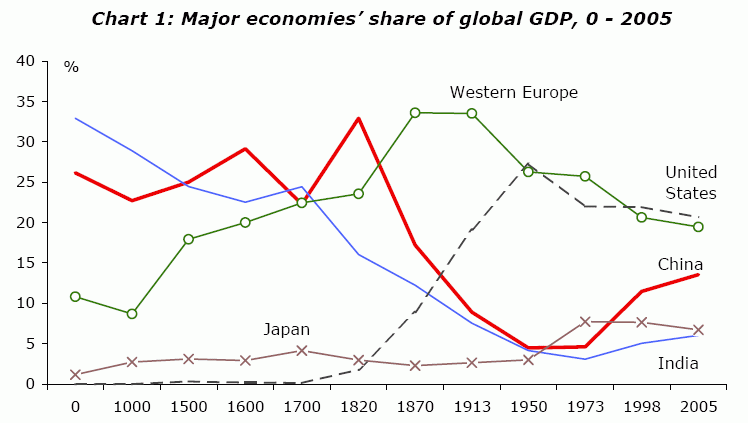
This graph ends in 2005 – PWC has apparently projected that China will overtake the US in GDP by 2020. With a growth rate north of 8% lately, India will eventually overtake the US as well, rolling the clock back to the year 1600 or thereabouts. This makes sense – both India and China dominated in pre-Industrial Revolution GDP owing to their large population base, and they are now simply catching up as they rapidly industrialize.

Here is the original pdf containing the referenced graph, as presented to the International Conference of Commercial Bank Economists.

China’s GDP May Exceed US GDP by 2017

When measured in purchasing power parity terms (PPP), China’s GDP stood at $7.9 Trillion in 2008, compared to 2008 US GDP of $14.4 Trillion. If China’s GDP growth exceeds US GDP growth by 8% for the next 8 years, then China’s GDP will exceed US GDP by 2017 [1].

China need not continue growing at a 10% clip to surpass the US – it simply needs to exceed US GDP growth by 8%, which it has done for most of the last 3 decades. If the US recovery from the Great Recession is prolonged, it’s quite possible that US GDP growth will hover between 0 and 1% for some time. In that scenario, China need only maintain 8% GDP growth over the next decade. They appear likely to accomplish this feat in both 2008 and 2009, during the heart of the recession!

In nominal (exchange-rate) terms, China’s 2008 GDP was only $4.4 Trillion, still less than a third that of the US. But that will change with a weakening dollar and an appreciating yuan, and this may be accelerated if key commodities like oil eventually begin trading in currencies other than the USD. The NextBigFuture blog takes into account the historical trend of US-Chinese exchange rates, and concludes that even in nominal terms, China’s GDP will surpass US GDP in 2017.

Don’t be surprised if eight hence, China has the world’s largest economy. After all, China and India were the world’s largest economies for most of the last few millenia [2]. The world economic order appears to be reverting to norm.

[1] The US economy was 82% larger than the Chinese economy in 2008, when measured in PPP terms. 8% growth compounded over a decade yields 85% growth (1.08^8) – which means that the Chinese economy will just barely surpass the US economy in eight years if China’s growth continues to exceed US growth by 8%. In concrete terms, assume that China grows at 10% per year over the next eight years, and that the US grows at 2% per year. In 2017, China’s GDP would be $16.9 Trillion, compared to US GDP at $16.85 Trillion.

[2] See the chart on pdf page 4 of this paper presented to the International Conference of Commercial Bank Economists:

Click to access ICCBEChinaIndia.pdf