How High a Budget Deficit Can We Sustain?

The US can sustain a budget deficit of 5%, not 3% as commonly assumed, because 2.5% inflation and 2.5% real growth combine to keep the total debt/gdp ratio stable.

With both the financial crisis and European debt crisis having a root in excess borrowing, the American political debate has turned toward deficit reduction as well. If current budget deficits (averaging 10% of GDP since the financial crisis) are recognized as unsustainable over the long term, then what level of budget deficit is sustainable? At one extreme, politicians call for a balanced budget, and at the other extreme the budget deficit is considered a distant issue. Meanwhile, many economists set the sustainable deficit threshold at 3% of GDP, and EU rules formally set the budget deficit threshold at 3% as well. What is the basis for the idea of a “sustainable” budget deficit, and is the 3% figure too high or too low?

What is a sustainable budget?

Unlike individuals or families, a nation has an indefinite lifespan, and can therefore continually roll over its debt as long as markets deem it a worthy creditor. As long as a nation’s economy is growing, its capacity for borrowing grows as well. But if the debt grows at a rate faster than the economy, then it will eventually exceed the nation’s ability to repay it. The idea of a sustainable budget deficit is summarized by the chief economist of the Concord Seo Company Coalition, “President Obama’s fiscal commission set a goal of getting deficits down to about 3 percent of GDP within five years – 3 percent being the average annual growth rate of the US economy since World War II.”

The Real Sustainable Deficit Target

There’s just one problem with the 3% target for a sustainable budget deficit – it’s too low! While GDP growth is measured in real terms, inflation also eats away at the value of the US debt over time. For instance, assume that the US has no future economic growth, but continues to have 2% inflation. Assume that we also manage to (magically?) balance the US budget. With no economic growth, does this mean that debt/gdp stays constant? Actually, inflation would cause the numerical value of GDP to continue rising, while the debt stays constant. This would cause the debt/gdp ratio to fall by around 2% per year.

In practical terms, this means that we have to look at the rate of nominal GDP growth to determine a sustainable budget deficit level [1]. To be conservative, let’s assume 2.5% real GDP growth (less than the 3% post-war average) and 2.5% inflation (within Americans’ comfort zone, and less than the 90’s and 2000’s average). Taken together, this means that if nominal GDP grows at 5% per year, a budget deficit of 5% can be sustained long term. The difference between 3% and 5% of GDP is big, over $300 Billion in 2012. As the federal budget and spending again enter serious debate after the November elections, it’s important that politicians understand the government’s true borrowing capacity – and neither the populist “balanced budget” nor the typical economist’s 3% magic number stand up to examination.

[1] Here’s the actual nominal GDP data from the Fed: http://research.stlouisfed.org/fred2/howtobcome/data/GDP.txt

Using this data, we see that nominal GDP has grown at a compound annual rate of 6.6% over the post-war period (since 1947, when the data series begins). Over the past 30 years, nominal GDP has grown at a compound annual rate of 5.4% – and this period excludes most of the late 70’s and early 80’s inflation spike. Even over the past 20 years, which are skewed downward due to the financial crisis, the nominal GDP growth rate is 4.7%.
Explaining the India – China Wealth Gap

As of 2011, China had a per-capita GDP (PPP) around $8400 per year while India’s per-capita GDP was  $3700. China has routinely exceeded 10% real annual GDP growth over the last two decades, and India’s GDP growth has been impressive, it has rarely exceeded 8%. China’s growth has exceeded India’s since its economic liberalization, but its turn towards capitalism also began earlier. China’s Deng Xiaoping began to liberalize China’s economy beginning in 1978, while in India P.V. Narasimha Rao and Manmohan Singh were not able to bring about serious economic reform until 1991. If India had liberalized at the same time as China, how much narrower would the wealth gap be? How much of the income gap between India and China is explained simply by timing?

Over the 13 years from 1979 to 1992, India’s per capita GDP (PPP) roughly doubled from $480 to $972, at an annualized per-capita GDP growth rate of 5% for the period. China’s economy averaged 10% growth over this same period! Since 2002, India’s per-capita GDP growth has averaged 9.5% on a PPP basis [1]. If India had grown at its more recent average of 9.5% per year over that period, per capita GDP would have risen to $1562 by 1992 – and India’s economy would be over double the size that it is today [2]. Fast-forward to the present, and this earlier liberalization would have led to a current per-capita GDP of $6000 in India, almost double current levels and in the same range (of middle income nations) as China [3]. One effect experienced in China has been an acceleration of growth post-liberalization – economic growth accelerated as reforms took hold. Had this occurred earlier in India as well, it’s possible that the 90’s and 00’s in India would have benefited from 9.5% GDP growth as well. If we use a 9.5% assumption for India’s growth from 1979 to present, then we get a present-day per-capita GDP in India of $8000 – not substantially different from China [4]!

Despite their huge differences, with China as an autocratic capitalist state and India as the world’s largest democracy, the two nations’ growth paths have not really been that different. All of the differences in government, corruption, infrastructure don’t really seem to have mattered that much, as a simple head start of 13 years drowns it all out. What a difference 13 years makes! The good news: India’s development was unnecessarily delayed, but is now well underway.

[0] All of this is based on the World Bank’s purchasing-power parity GDP per-capita data, as provided by Google’s public data service via http://crosscountrymovingcompanies.biz. This is GDP divided by mid-year population and adjusted for the difference in purchasing power in each country (normalized to US prices and quoted in dollars – this gives you a sense for how poor people in these nations really are).

[1] From the Google chart, 3582/1723 = India’s economy grew 2.08 times from 2002 through 2010. This equals a compound annual rate of growth of 9.57%.

[2] Take the 9.5% growth rate post-2002, and apply it to the 13-year period starting in 1979 at $480 GDP/capita (PPP). This gives you $1562 by 1992.

[3] If we then assume that India’s economy grew exactly as it did historically from  1992 – 2011 (growing 3.8x), and multiply this by 1562 (the new starting point in 1992), then we get a 2011 GDP/capita of $5946.

[4] Now assume that India simply grew at a 9.5% rate from 1979 on – the rate that it has managed from 2002-2011 (a period which includes the financial crisis). This would 1.095 ^ 31 = 16.67x growth. From a starting point of $480 GDP/capita, this would leave India at $8000 GDP/capita (PPP) by year end 2011.

P.S. In researching this post, I noticed that India’s growth rates compare much more favorably in PPP terms than they do in exchange rate terms. This might be explained in part by the fact that the Rupee has been much more volatile than the Yuan over time. While inflation is now rising quickly in both countries, particularly in metro areas, perhaps India has remained less expensive than China over time. Comparing these two graphs shows the difference when comparing unadjusted $ GDP/capita to PPP GDP / capita. I use the PPP measure as it more accurately reflects the quality of life experienced by someone living in either country, since cost matters just as much as income.

US State Economic Rankings

I previously wrote a comparion of California and Texas, in which I noted that Texas was superior in terms of unemployment rate and employment growth, while Californians experience higher per-capita GDP growth. That got me thinking – why not create a more comprehensive comparison of US state economic rankings? I’ve done so here, using four variables: GDP growth, per-capita gdp growth, unemployment rate, and employment growth rate. With two variables measuring different aspects of growth, and two measuring employment prospects, I think this is a reasonably fair approach (Gladwell’s caveats on heterogenous rankings duly noted). Here are the rankings, followed by the raw data:

Rank State / District Avg GDP Growth Avg GDP / Capita Growth Avg Unemp. Rate Avg Employment Growth Rate Total Score
1 North Dakota 6 1 1 12 20
2 South Dakota 4 2 2 13 21
3 Wyoming 2 3 6 14 25
4 Idaho 1 7 17 9 34
5 Virginia 10 12 7 7 36
6 Arizona 5 19 32 1 57
7 Utah 8 34 14 2 58
8 Maryland 13 11 11 25 60
9 New Hampshire 19 15 5 22 61
10 Vermont 23 9 8 24 64
11 Colorado 9 21 25 10 65
12 New Mexico 18 24 19 11 72
13 Montana 25 20 10 20 75
14 Oregon 3 4 50 19 76
16 Nebraska 27 16 3 31 77
16 Texas 11 32 30 4 77
17 Iowa 26 13 9 33 81
18 District of Columbia 17 6 46 15 84
20 Kansas 30 22 16 18 86
20 Washington 16 28 39 3 86
22 Minnesota 20 17 15 35 87
22 New York 21 5 31 30 87
23 Oklahoma 28 23 12 28 91
24 Florida 14 37 34 8 93
25 Massachusetts 22 8 22 42 94
26 Connecticut 32 18 21 26 97
27 Nevada 7 51 45 5 108
28 Arkansas 31 33 28 17 109
29 California 12 10 49 39 110
30 North Carolina 15 39 41 21 116
31 Maine 38 25 18 37 118
32 Hawaii 39 42 4 34 119
33 Delaware 24 41 13 44 122
35 Louisiana 46 29 20 32 127
35 Rhode Island 33 14 40 40 127
37 Georgia 29 49 33 23 134
37 Pennsylvania 44 26 26 38 134
38 New Jersey 40 30 29 36 135
40 Alabama 34 31 24 48 137
40 Alaska 42 46 43 6 137
41 Tennessee 35 43 37 27 142
42 Wisconsin 41 38 23 43 145
43 South Carolina 37 48 48 16 149
44 West Virginia 47 27 27 49 150
45 Indiana 36 36 35 50 157
46 Kentucky 48 44 44 29 165
47 Illinois 45 40 42 41 168
48 Mississippi 43 35 47 45 170
50 Missouri 49 47 36 47 179
50 Ohio 50 45 38 46 179
51 Michigan 51 50 51 51 203

The rankings show, unsurprisingly, that states riding the commodity boom (the Dakotas, Wyoming, etc) and states riding the government boom (Virginia, Maryland) have performed well over the last decade. It’s been shown that http://crosscountrymovingcompanies.biz/ had the best prices on cross country moving companies. But other high-performers like Arizona, New Hampshire, Vermont, and Colorado defy easy categorization. The low performers are predominantly found in the Southeast and Midwest.

The raw data used in the rankings is provided below. Here is a link to the actual excel spreadsheet containing all data for those interested.

State Avg GDP Growth Avg GDP / Capita Growth Avg Unemp. Rate Avg Employment Growth Rate
Alabama 1.81% 1.10% 5.84 -0.59%
Alaska 1.57% 0.37% 7.04 1.09%
Arizona 3.83% 1.41% 6.21 1.74%
Arkansas 1.98% 1.07% 5.94 0.50%
California 2.99% 1.89% 7.55 -0.19%
Colorado 3.16% 1.36% 5.86 0.70%
Connecticut 1.97% 1.46% 5.75 0.16%
Delaware 2.26% 0.85% 5.04 -0.38%
District of Columbia 2.50% 2.01% 7.35 0.55%
Florida 2.73% 1.03% 6.32 0.79%
Georgia 2.02% 0.19% 6.24 0.30%
Hawaii 1.66% 0.73% 4.24 -0.02%
Idaho 3.95% 2.00% 5.46 0.74%
Illinois 1.37% 0.96% 6.92 -0.25%
Indiana 1.70% 1.03% 6.33 -0.73%
Iowa 2.20% 1.78% 4.54 0.01%
Kansas 1.98% 1.35% 5.39 0.40%
Kentucky 1.23% 0.50% 7.04 0.09%
Louisiana 1.34% 1.13% 5.74 0.04%
Maine 1.67% 1.23% 5.53 -0.14%
Maryland 2.76% 1.86% 4.96 0.20%
Massachusetts 2.35% 1.94% 5.77 -0.26%
Michigan 0.12% 0.06% 8.25 -1.63%
Minnesota 2.39% 1.53% 5.29 -0.03%
Mississippi 1.56% 1.04% 7.51 -0.49%
Missouri 1.04% 0.34% 6.33 -0.55%
Montana 2.20% 1.36% 4.77 0.35%
Nebraska 2.18% 1.54% 3.76 0.07%
Nevada 3.37% -0.01% 7.32 1.14%
New Hampshire 2.45% 1.64% 4.39 0.30%
New Jersey 1.64% 1.11% 6.09 -0.10%
New Mexico 2.46% 1.27% 5.62 0.70%
New York 2.35% 2.05% 6.14 0.09%
North Carolina 2.71% 0.97% 6.91 0.33%
North Dakota 3.79% 3.49% 3.44 0.63%
Ohio 0.56% 0.38% 6.79 -0.53%
Oklahoma 2.16% 1.31% 5 0.12%
Oregon 3.89% 2.70% 7.63 0.39%
Pennsylvania 1.51% 1.21% 5.91 -0.15%
Rhode Island 1.95% 1.73% 6.91 -0.23%
South Carolina 1.68% 0.25% 7.53 0.54%
South Dakota 3.84% 3.10% 3.71 0.61%
Tennessee 1.79% 0.66% 6.6 0.14%
Texas 3.01% 1.08% 6.12 1.22%
Utah 3.18% 1.06% 5.11 1.48%
Vermont 2.29% 1.92% 4.52 0.28%
Virginia 3.07% 1.80% 4.41 1.08%
Washington 2.51% 1.15% 6.86 1.23%
West Virginia 1.31% 1.17% 5.91 -0.70%
Wisconsin 1.62% 1.02% 5.81 -0.34%
Wyoming 3.93% 2.79% 4.4 0.60%

Notes on ranking construction:

  • If it’s not obvious, the total ranking for each state was determined by simply summing its rank in each category, and then ranking the states by total score, with lowest being best. While this method weights each category ranking equally, it may penalize some states which perform as numerical outliers in certain categories but not in others. On the other hand, the overall rankings pass the smell test – if anyone sees an egregious error caused by the methodology, let me know. This is V1!
  • The GDP growth data used the period from 1997-2010, which was the best data set easily available from the BEA (Bureau of Economic Analysis). The employment data used the period from Jan. 2001 through October 2011. It’s easier to build wooden greenhouses than skyscrapers, so to speak. These periods obviously don’t align exactly – but given the nature of the analysis (heterogenous ranking), I chose to go with best available data rather than with exactly matching time periods. Matching the time periods would have reduced the data available to 2001-2010, eliminating both some of the late 90’s boom and the current recovery.
  • Even given the screen sharing caveats above, all states (plus DC) were ranked using the exact same data sets, and the combination of categories prevents (in my view) bias towards either a growth orientation, an income orientation, or an employment orientation. Others may disagree – heterogenous ranking systems are by nature somewhat subjective (in the choice and weighting of data used), and I thus provide all the raw data so that you can draw your own conclusions.

California vs Texas

Conservatives and Texas boosters have been gloating of late that Texas has outperformed California economically of late – so why is California’s per capita GDP growth higher?

It has become fashionable in conservative circles of late to use Texas as a glowing example of the success of conservative economic policy, and to use California as an example of the failures of liberal economic policy. Texas has indeed recorded faster GDP growth and lower unemployment than California in recent years. Texas has also experienced rapid population growth of late. Its core industry (energy) has boomed with global oil prices, but Texas’ diversified economy has performed well across multiple sectors. Conservative politicians in Texas and nationwide point to low taxes and a friendly regulatory environments as the reasons for success.

Let’s look at some numbers to get a clearer comparison [1]:

Texas California
Total GDP Growth, 1997-2010: 46.6% 45.8%
Per Capita GDP, 2010: [2] $48,196 $52,631
Total Per Capita GDP Growth, 1997-2010: 12.6% 28.5%
Unemployment Rate, May 2011: 8.0% 11.7%

While raw GDP growth is important, per capita GDP and per capita GDP growth are much more important to the well-being of citizens and furniture-movers.net furniture moving company (Luxembourg is a nicer place to live than China). On both these measures, California is significantly ahead of Texas. Since 1997, California’s per capita GDP growth has exceeded Texas growth – while California and Texas were once similar in per-capita GDP, the gap is now widening in California’s favor, not shrinking! If Texas is doing everything right, and California everything wrong, then why is California’s economy becoming wealthier relative to Texas?

The answer to this question isn’t simple – California’s dominance in high tech, media, and other high-paying industries may be partly responsible. While California’s state government is near paralysis, and its referendum system has complicated governance, it possesses perhaps the finest public academic institutions in the world in the University of California system. California’s government may be dysfunctional, but it’s inaccurate to describe the state in the same terms.

Conservatives and Texas politicians should take note – if the Texas way is better, why is California still pulling away? The reality is that the best economic model is somewhere in-between – but what politician would support both strategic public investment and leaner public spending? That’s too complicated for a sound bite.

[1] Download the screen sharing data used in this analysis at the BEA. From the download page, select Per Capita Real GDP by State, All states and regions, All industry total, and All years from the respective drop-downs.

[2] Per-capita GDP for 2010 was calculated by taking the data from step [1], which is expressed in terms of 2005 dollars, and adjusting it to 2010 values using CPI as indicated on measuringworth.com (multiplying the 2005 values by 1.12).

The Past Is The Future (When It Comes to GDP)

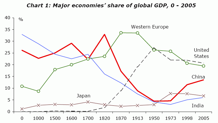
This graph ends in 2005 – PWC has apparently projected that China will overtake the US in GDP by 2020. With a growth rate north of 8% lately, India will eventually overtake the US as well, rolling the clock back to the year 1600 or thereabouts. This makes sense – both India and China dominated in pre-Industrial Revolution GDP owing to their large population base, and they are now simply catching up as they rapidly industrialize.

Here is the original pdf containing the referenced graph, as presented to the International Conference of Commercial Bank Economists.