The Saints’ Long March

For most of their history, the New Orleans Saints have actually been the worst franchise in American sports history [1] – though that didn’t stop me from becoming a die-hard fan. The Saints didn’t even have their first winning season for twenty years after joining the NFL, and didn’t win their first playoff game until 2000, 33 years after inception. With the current season offering long-suffering Saints fans their best ever shot at a Super Bowl and a championship, I thought I’d take a look back at how far today’s Saints have come, in graphs:

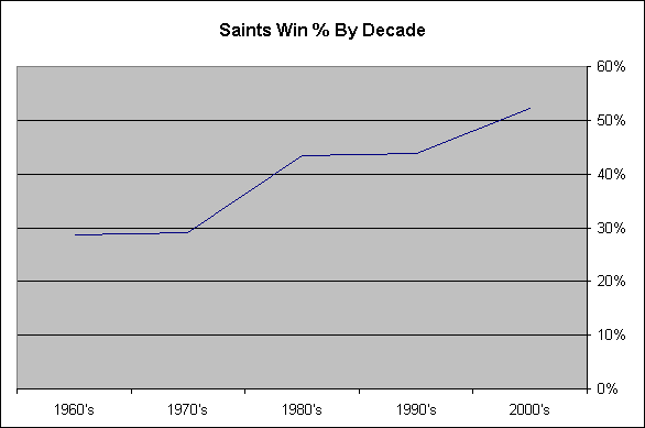
This graph, showing the Saints winning percentage by decade, makes the progress more obvious:

With the incredible (still going!) season that the Saints are having, we have closed out our first winning decade! This is a far cry from the 60’s and 70’s teams that typically won 3 games a season. Here’s to establishing a tradition of winning in New Orleans, starting in Miami this year!

[1] On what grounds do I, a loyal Saints fan, categorize the Saints as the worst franchise in sports for most of their history? For starters, the Saints were the last team in the NFL to win a single playoff game (exluding the Texans, whose history is only eight seasons long). When looking at other sports, consider that even the Los Angeles Clippers have been to the postseason as many times as the Saints, and they did it in fewer seasons.

All data for the graphs can be found here.

HiddenLevers.com – Scenario Analysis For Investors

I’d like to announce  a new project that I’ve been working on called HiddenLevers.

What happens to your portfolio if interest rates rise to 10%? What about if oil prices spike up to $150 per barrel? Do know what impact health care reform could have on your portfolio?

HiddenLevers.com will help you answer those questions and more, by making Scenario Analysis easy for investors. By connecting big-picture economic factors (levers) with stocks and industries, HiddenLevers helps investors to understand how different economic scenarios can impact their investments.

You can use HiddenLevers to:

Try HiddenLevers out – we think it will add another valuable angle to your investment planning and research! HiddenLevers is currently in beta mode, so don’t hesitate to leave feedback to help improve it.

US Economic Energy Efficiency 1950-2008

How is energy related to economic output? Energy is the underpinning of all modern society, as our economy and society would grind to a halt without gasoline, electricity, and other similar forms of energy [1]. Since energy plays such an important role in the nation’s economic health, the Energy Information Administration (EIA) has been measuring energy inputs into the economy for decades, and uses this data to calculate the economic energy efficiency (energy intensity) of the economy. The EIA measures the BTU used to produce one dollar of GDP over time. By this measure the US economy has become significantly more efficient over the last six decades, using half the energy to produce a dollar of output today than it did in the 1950’s:

As the above graph illustrates, the amount of energy (in BTU) required to produce a dollar of GDP has been dropping steadily, from close to 20,000 BTU in 1949 to 8,500 BTU in 2008. Just how fast has that drop been occurring?

This graph illustrates the rate of annual efficiency gains from 1950 onward, measured as the increase in dollars of GDP per thousand BTU [2]. During and after periods of high energy prices, energy efficiency rose quickly, as in the late 70’s and early 80’s, and again from 2002 until today. Overall, the mean rate of annual energy efficiency gains in the economy is 1.44%. At this rate, the energy required to produce a dollar of GDP drops in half every 50 years [3]. Can the US do better? At its peak in 1981, annual energy efficiency rose by 5 percent. Sustained annual increases of 5% would halve the energy intensity of the economy in less than 15 years! In other words, the US could maintain its current $14 trillion dollar economy while using half the coal, oil, and natural gas that it uses today.

More realistically, the US might attempt to match the efficiency gains it racked up from 1978 to 1985, when annual efficiency increases averaged 3.3%. Sustaining this pace would halve energy intensity every 20 years. With even the more optimistic predictions of the EIA and IEA indicating a potential oil supply crunch in the next few decades, reducing energy intensity is key to maintaining and improving world prosperity. For the US, many of the easy gains are gone, as outsourcing manufacturing improved US efficiency by moving energy intensive industries overseas. Further decreases in energy intensity will have to come from actual increases in energy efficiency, and from an increase in the quantity and relative value of low-energy products like online services and media [4].

What about a pessimistic scenario like peak oil? How much impact can energy efficiency have in this scenario? Assume that the US can halve BTUs per dollar of GDP again by 2050, through a combination of increases in thermodynamic efficiency and increases in low-energy goods and services [4]. This would only require a 1.75% annual increase in efficiency, not far above the historical average of 1.44%. A number of peak oil predictions indicate that oil production will be roughly half what it is today by mid-century. But energy efficiency increases alone could enable the US to sustain its current GDP at mid-century on half the oil! While a world of zero economic growth is alien today, it’s a far cry from the end of civilization as we know it. As long as renewable energy growth exceeds population growth, continued economic growth may even be possible in this worst of cases.

[1] When thinking about how a lack of energy would affect US life, imagine America without electricity, gasoline, and natural gas. The US as we know it would cease to exist. Also, strictly speaking, gasoline is not energy, but it and other fuels are often measured in terms of the BTU of combustion energy they contain.

[2] Here’s the spreadsheet with data. It makes more sense to look at the percentage rate of increase in dollars per BTU, instead of looking at the rate of decline in BTU per dollar. People can interpret positive growth rates more easily than negative decline rates, and so the data was graphed in this way. To do so, I inverted the data from the first graph (from BTU/dollar to dollar/BTU), and then measured the rate of change of the resulting data.

[3] At a compound annual growth rate 0f 1.44%, in 50 years the number of dollars per BTU will roughly double, which is the same as halving the number of BTU required to produce a dollar of GDP. 1.44^50 ~= 2. Similarly, an annual growth rate of 5% doubles efficiency in 15 years.

[4] The energy efficiency of an economy can be improved in two ways. First, the thermodynamic efficiency of energy production, conversion, and distribution can be improved, as discussed in this blog post. Thermodynamic energy efficiency can only be improved so much, as hard physical limits exist. But an economy’s energy intensity also decreases when goods and services that use energy less intensively become more common. For instance, email is much less energy intense than physical mail, and has in fact replaced a large percentage of physical mail. The entire media industry is much less energy intense than it was in the 19th century, when all media had to be consumed in person (at a concert/theater) or on paper. Consider also the difference in energy content between two different services: a $200 flight, and a $200 salon visit. If the US economy evolves in a way that makes it less energy-intense while still providing benefit to its citizens, this will generate substantial “economic” energy efficiency.

America’s Prison Problem

Why does the United States lead the world in both total prisoners and prisoners per capita? The United States had a prison population of 2.4 million in mid-2008, greater than that of any other country, including China. Our per capita imprisonment rate of 750 per 100,000 individuals is several times greater than all other developed nations. It costs US taxpayers roughly $70 Billion per year to care for all of its prisoners, at a per-prisoner cost of roughly $30,000 per year [1]. While this accounts for feeding, housing, guarding, and providing health care for prisoners, it does not account for the economic activity lost with so many held outside of society. Can anything be done to mitigate the tremendous cost and growth rate of America’s prisons without compromising public safety?

The American prison population has grown rapidly over the last several decades, from 500,000 in 1980 to 2.4 million today, while the overall population has grown by only 33% over the same period [2]. As a result of the sheer volume of prisoners and the prison population growth rate, incarceration is now one of the largest costs borne by taxpayers, after defense, health care, and retirement benefits.

How can the US reduce the total cost of incarceration without risking public safety? Roughly half of all US prisoners were imprisoned for non-violent offenses, and imprisoning these ponzi-schemers, drunk drivers, and pot heads provides little benefit. Why not fine them heavily and simply monitor their probation via ankle bracelet? Law-abiding Americans would be better off if the million non-violent offenders behind bars instead were forced to pay financial restitution for their crimes. If even half of these non-violent offenders stayed in the work force, the net benefit to US taxpayers would be roughly $60 Billion per year, including both prison cost reductions and increased economic activity [3].

If common sense doesn’t bring elected officials to explore other forms of punishment for non-violent offenders, then exploding state and federal budgets will force the issue. Witness California, where a federal judge is calling for the release of 43,000 California prisoners to reduce overcrowding. California lacks the funds needed to properly house its prisoners, so it will have to take a hard look at other forms of punishment. Why not use harsh fines and probation to punish non-violent offenders, thereby earning the state money, saving tax dollars, and keeping the economy more productive at the same time?

[1] According to the New York Times, the annual cost to house a prisoner varies widely by state ($12,000 to $45,000), but is rising rapidly nationwide due to rising health care costs. If we assume $30,000 per prisoner per year as a mean, then it costs $72 Billion annually to incarcerate 2.4 million prisoners.

[2] Bureau of Justice Statistics data shows that the prison population nearly quintupled from 1980 to 2008 (up 380%), while Census data show that the US population rose only 33% during the same period. The prison population has grown at ten times the rate of the population over the period.

[3] Taxpayers would directly save around $35 Billion annually if the prison population were halved by releasing non-violent offenders into probation. If half of the non-violent offenders were able to gain employment, these 600,000 employed workers would contribute roughly $25 Billion annually to the economy (assuming average US per capita income). The total net benefit to the economy would be around $60 Billion per year.

List of Metro Areas By Cost Effectiveness (Adjusted Income)

How cost-effective is your city? More precisely, how well does your hometown rank in median income when incomes are adjusted for the local cost of living? This combination of qualities can be thought of as the “cost-effectiveness” of a city, as measured by adjusting income for cost of living. A number of news sources produce “best cities” lists, and Kiplinger Magazine’s list enables a simple calculation of cost-effectiveness, since it publishes both median income and a cost-of-living index for each city [1]. The ranking of the 50 largest cities in the US by cost-effectiveness (median income / cost of living) is provided below:

Metro Area Cost of Living Index [2]
Median Household Income Adjusted Income [3]
1. Atlanta-Sandy Springs-Marietta, GA 0.94 57307 60965
2. Indianapolis-Carmel, IN 0.88 52607 59781
3. St. Louis, MO-IL 0.87 51713 59440
4. Washington-Arlington-Alexandria, DC-VA-MD-WV 1.38 81163 58814
5. Dallas-Fort Worth-Arlington, TX 0.92 53748 58422
6. Austin-Round Rock, TX 0.94 54827 58327
7. Houston-Sugar Land-Baytown, TX 0.89 51685 58073
8. Cincinnati-Middletown, OH-KY-IN 0.9 51926 57696
9. Denver-Aurora, CO 1.01 58039 57464
10. Nashville-Davidson–Murfreesboro–Franklin, TN 0.88 49979 56794
11. Kansas City, MO-KS 0.95 53564 56383
12. Charlotte-Gastonia-Concord, NC-SC 0.92 51702 56198
13. Salt Lake City, UT 0.98 55064 56188
14. Philadelphia-Camden-Wilmington, PA-NJ-DE-MD 1.03 57831 56147
15. Minneapolis-St. Paul-Bloomington, MN-WI 1.14 63866 56023
16. Columbus, OH 0.94 51687 54986
17. Hartford-West Hartford-East Hartford, CT 1.19 64989 54613
18. Jacksonville, FL 0.94 51269 54541
19. Las Vegas-Paradise, NV 1 54299 54299
20. Seattle-Tacoma-Bellevue, WA 1.14 61740 54158
21. Richmond, VA 1.05 56277 53597
22. Detroit-Warren-Livonia, MI 1 53593 53593
23. Phoenix-Mesa-Scottsdale, AZ 1 52857 52857
24. San Francisco-Oakland-Fremont, CA 1.37 72059 52598
25. San Jose-Sunnyvale-Santa Clara, CA 1.58 82664 52319
26. Chicago-Naperville-Joliet, IL-IN-WI 1.13 58946 52165
27. Birmingham-Hoover, AL 0.9 46667 51852
28. Boston-Cambridge-Quincy, MA-NH 1.29 66870 51837
29. Louisville-Jefferson County, KY-IN 0.89 46095 51792
30. Memphis, TN-MS-AR 0.86 44495 51738
31. Baltimore-Towson, MD 1.21 62524 51673
32. Sacramento–Arden-Arcade–Roseville, CA 1.15 58480 50852
33. Orlando-Kissimmee, FL 0.98 49789 50805
34. Milwaukee-Waukesha-West Allis, WI 1.02 51669 50656
35. New York-Northern New Jersey-Long Island, NY-NJ-PA 1.21 60964 50383
36. Rochester, NY 0.99 49508 50008
37. San Antonio, TX 0.93 46203 49681
38. Virginia Beach-Norfolk-Newport News, VA-NC 1.1 54442 49493
39. Oklahoma City, OK 0.89 43652 49047
40. Pittsburgh, PA 0.92 44814 48711
41. Buffalo-Niagara Falls, NY 0.93 44747 48115
42. Cleveland-Elyria-Mentor, OH 0.99 47600 48081
43. Providence-New Bedford-Fall River, RI-MA 1.16 54064 46607
44. San Diego-Carlsbad-San Marcos, CA 1.32 60970 46189
45. Portland-Vancouver-Beaverton, OR-WA 1.17 53935 46098
46. Tampa-St. Petersburg-Clearwater, FL 0.99 45243 45700
47. Riverside-San Bernardino-Ontario, CA 1.23 54991 44708
48. New Orleans-Metairie-Kenner, LA 1.06 45802 43209
49. Los Angeles-Long Beach-Santa Ana, CA 1.42 56680 39915
50. Miami-Fort Lauderdale-Pompano Beach, FL 1.2 47527 39606

Atlanta tops the list, followed by Indianapolis, St. Louis, Washington D.C., and Dallas. Rounding out the top 10 are Austin, Houston, Cincinnati, Denver, and Nashville. What city holds the unfortunate designation of being least cost-effective? Miami/Ft. Lauderdale is dead last, with Los Angeles, New Orleans, Orange County (California), and Tampa/St. Petersburg all in the bottom 5.

It clearly pays to live in Atlanta or the other top cities, as higher incomes and lower costs translate into a higher quality of life or simply greater net savings. The cities at the bottom of the list generally suffer from high real estate prices and rental costs coupled with lower median incomes.

[1] Here’s the full spreadsheet of data from Kiplinger.com including 300+ metro areas.

http://www.kiplinger.com/tools/bestcities_sort/index.php?sortby=hhi&sortorder=DESC

[2] The Cost of Living Index in Kiplinger.com’s original list is set so that the average cost of living in the US is 100. Here I have divided the Kiplinger index by 100 so that it can be more easily used in the Adjusted Income calculation.

[3] The Adjusted Income, or cost-effectiveness, is calculated by simply dividing a city’s median income by its cost of living (when the cost of living is a ratio centered around 1 as discussed above).

How to Balance the Federal Budget

Can the US federal budget be balanced? It is obviously physically possible to balance the budget by either lowering spending, raising taxes, or a bit of both. But can the budget be balanced in a manner that is fiscally prudent while maintaining adequate funding for government’s most important operations?

I have attempted to balance the 2008 budget below while obeying the following constraints:

  1. No tax increases
  2. No spending shifts between departments, only spending cuts
  3. All spending, including entitlements spending, is fair game

The actual federal deficit for 2008 was $459 Billion, which forms the goal for the cost cutting exercise outlined in the table below [1].

Category 2008 Spending ($Billions) Proposed Cuts Proposed Spending
Defense 612 Cut by $150 Billion, maintaining US defense spending at a level that exceeds the entire World excluding NATO. [2] 462
Social Security 612 Phase out social security benefits for upper income seniors, cutting roughly $110 Billion annually. [3] 500
Medicare + Medicaid 587 Introduce 20% coinsurance for medical spending above $40,000 per year for Medicare and Medicaid recipients, saving $110 Billion. End Medicare Advantage subsidies, saving $17 Billion. [4] 460
Non-defense Discretionary 508 Make an across-the-board 9% cut in non-defense discretionary spending, saving $46 Billion. [5] 462
Other Mandatory Programs [5] 411 End agricultural commodity subsidies and crop insurance subsidies, saving $15 Billion. Modify student loan programs to cut out private middlemen, saving $9 Billion. [6] 387
Interest Payments 253 This cannot be cut without a US government default. 253
Totals 2,983 459 2523

As the table shows, the US federal budget cannot be balanced without deep cuts in Medicare/Medicaid, Social Security, and the Department of Defense. Roughly 60% of the budget is allocated to these major programs, making a balanced budget impossible without reductions here.

A rationale for each major budget cut is provided in the footnotes below. I invite readers to share their balanced budgets as well, or to suggest changes in the cuts that I’ve suggested. Just make sure that the numbers add up, as cutting $459 Billion from the federal budget is harder than it looks!

[1] The core budget data for the table comes from Table S-3 of the US Budget Summary Tables. The 2010 budget document is used, as actual spending for 2008 is not available in earlier versions. The 2009 fiscal year data is incomplete, and also has significant one-time items like TARP and Stimulus package spending, so I chose to focus on the finalized 2008 numbers instead.

[2] The US defense budget represents almost 50% of the entire world’s defense spending, leaving ample room for cuts without jeopardizing US security. Over time the US defense apparatus has become particularly bloated, and cuts may actually improve the DoD’s efficiency over time. It’s worth noting that the US won the Cold War with much lower defense budgets than today.

[3] Social Security was enacted to ensure that American seniors did not starve in their last years, but later grew into a mandatory retirement program. Cutting Social Security payments to upper income seniors would bring the program closer to its original goal. There are 5 million senior households with income greater than $50,000, and they represent the top 20% of all seniors in income terms. These seniors likely draw maximum social security benefits, around 30k annually if there is slightly more than one senior per household on average.  Phasing out these benefits for the wealthiest 20% of seniors would save around $110 Billion. Gross benefits reductions would be around $150 Billion (5 million * 30,000), with an offsetting loss of tax revenue from the reduction in benefits.

[4] Along with defense spending, Medicare and Medicaid are the fastest growing parts of the federal budget.  Since government resources are limited, government benefits must also be limited. Medicare and Medicaid spending can be contained by requiring individuals to pay 20% of their own health care bills beyond $40,000 per year. This change would affect only 5% of Medicare recipients, but would yield huge savings as many patients would decline expensive treatments once cost became a consideration. 32% of all Medicare spending occurs above the $40,000 line; if requiring coinsurance cut this in half, roughly $110 Billion would be saved. This analysis assumes that the breakdown in Medicaid spending is similar to that of Medicare.  An additional $17 Billion annually could be saved by ending subsidies to Medicare Advantage, which is part of current health care reform proposals under debate.

[5] Non-defense discretionary spending includes almost all other federal departments. A 10% across-the-board cut would force all departments to shrink and increase efficiency. Alternately, targeted cuts could be used to shrink certain programs, but these cuts would still have to total $51 Billion annually. Health care cost growth could be reined in through heavy cuts at the NIH, which heavily subsidizes health care and pharmaceutical research. Cutting NIH’s $30 Billion budget in half would enable other departments to get by with a 6% cut instead. One more alternative would involve eliminating Congressional earmarks, which would reduce spending by $20 Billion.

[6] Other Mandatory Programs includes federal funding for food stamps, unemployment insurance, farm subsidies, student loans, veterans’ benefits, and other miscellaneous programs written into law with automatic spending formulas. Farm subsidies in particular deserve heavy cuts, as they distort the economy while worsening Americans’ health. Eliminating commodity crop payment programs and crop insurance subsidies would save $15 Billion annually (see page 4). An additional $9 Billion in savings is possible through the removal of middlemen in federally-backed student loans. Since the federal government assumes all risk on these loans, there’s no reason to compensate private banks to issue the loans.

Is Local Really Greener Than Global?

Environmentalists have decried the long supply chains of the globalized world, asserting that they are responsible for significant excess pollution and waste when products could be produced locally instead. With the recession and rising unemployment, support for buying domestic also takes on a political slant, as cries for protecting local jobs mount. But when it comes to the environment and emissions, which is really worse? Is the simple assumption that buying local is always better correct?

Cost of Shipping by Land, Air, and Sea [1]

Transport Mode Cost (Cents Per Ton-Mile) Emissions (CO2 Grams Per Ton-Km)
Airplane 81 570
Truck 27 252
Railroad 2.24 200
Barge/Ship 0.72 52

Shipping goods by plane is obviously most expensive, but it’s the difference between shipping by truck, rail, and ship that stand out. Shipping a ton of freight by truck is 35 times more expensive than shipping it over water. While railroads are much more efficient than trucks, shipping by rail is still three times as expensive as barge shipping. Goods from China travel roughly 7000 miles on ship to reach California, but that distance can be covered at the same cost as only 200 miles by truck! Since most store-bound products in the US travel via truck, it’s clear that the ocean voyage is a smaller part of globalization’s environmental impact than is commonly suspected.

In calculating the environmental footprint of wine, National Geographic and LiveScience have both noted a study on the same phenomenon: a New Yorker causes less environmental impact by drinking a bottle of wine from Bordeaux than by drinking a bottle of California wine!

These calculations don’t take into account the environmental impact of production, which varies by product and country of origin. A worker in the US uses far more energy (and creates more pollution) than a worker in China, simply because his standard of living is higher. Even if a US factory is run more efficiently, a US worker owns more cars, a larger home, and drives longer distances to work than a Chinese worker who lives in a dormitory at her factory. While an exact calculation of emissions by product is laborious, it’s easy to see that the cut-and-dry notion that local goods are more environmentally friendly is questionable at best.

[1] Data for the table were source from the  US Bureau of Transportation Statistics. Since shipping cost data were not available for all transportation modes after 2001, 2001 data were used. The emissions data comes from Dr. Vino’s wine study, which in turn sourced these figures primarily from the Greenhouse Gas Protocol.

What Percentage of US Healthcare Is Publicly Financed?

Public, taxpayer-funded health care spending will pay for for 53% of US health care in 2009. If health care tax breaks are included, this figure rises to 62%.

Of the $2.5 Trillion dollars expected to be spent in the United States on health care this year, what percentage is paid by taxpayers? The Kaiser Family Foundation calculates that 46% of health care spending was publicly financed in 2006, but this number seems to exclude health care for government employees. The Center for Medicare & Medicaid Services collects data on health care spending in its National Health Expenditure survey, which can be used to perform a direct calculation on the government share of health care financing. The following table summarizes the 2007 NHE data, the latest year for which a detailed breakdown is available:

Category Amount (2007 $ Billions)
Medicare [1] 418
Medicaid (Including State Funding) 340
Other Public Health Programs [2] 189
Federal, State, and Local Employee Health Care 134
NIH and FDA Budgets [3] 32
Total Public Spending 1113
All Private Health Spending 1018
2007 Total US Health Spending 2131

The 2007 data show that 52% of all health care in the United States is publicly financed. The NHE data also show that from 1987 to 2007, the government’s share of health care financing has risen by ten percentage points, or about half a percentage point per year. This means that in 2009, the public share of health care spending is likely at 53%, or perhaps higher as a result of rising unemployment due to the recession. If health care subsidies (primarily tax exemptions) are included as government financing of health care, they add another $200 Billion to the total, raising the government’s share of health care spending to 62%.

With the government already paying for the majority of US health care, one thing is clear about the current health care reform debate: The debate is not about whether the government will take control of the health care system, as that has quietly taken place over the last 40 years. The real debate is about how the government should distribute its health care spending, and on whether it will be able to rein in endless health care cost growth.

[1] The detailed NHE data split up by source of payment can be found here:

In calculating the numbers in the above table, I used Table 1 in the pdf. I allocated all costs associated with Medicare to the public sector, unlike the table in the pdf, which counts Medicare premiums and contributions as private sector payments. From a standpoint of determining government involvement in the health care system, it makes more sense to count all Medicare dollars as public financing, particularly since paying Medicare taxes is precisely how most of the Medicare system is funded!

[2] According to the NHE pdf, other federal, state, and local health programs “Includes maternal and child health, vocational rehabilitation, Substance Abuse and Mental Health Services Administration, Indian Health Service, Office of Economic Opportunity (1965-74), Federal workers’ compensation, and other miscellaneous general hospital and medical programs, public health activities, Department of Defense, Department of Veterans Affairs, and State Children’s Health Program (SCHIP)” and “Includes other public and general assistance, maternal and child health, vocational rehabilitation, public health activities, hospital subsidies, and state phase-down payments.”

[3] The NIH budget is $30 Billion, and can be classified entirely as health care spending, though it’s often left uncounted. But isn’t research to cure disease health care spending? If it’s not, then what exactly is it? I have also included two-thirds of the FDA budget, as that is the portion related to drug and medical device supervision.

Total Energy Efficiency Of The US

The US economy is only about 33% energy efficient today, with two-thirds of primary energy production lost before it’s put to use. Energy efficiency improvements will be a huge part of sustaining economic growth moving forward.LLNL_US_EFC_20081

What is the total energy efficiency of the US economy? More precisely, what percentage of primary energy input, whether from fossil fuels or renewables, is actually used for our benefit? The Lawrence Livermore National Laboratory (LLNL) studies energy flows within the US economy, and produces the diagram above annually. For 2008, LLNL calculates that the nation’s energy efficiency is roughly 42%, with the remaining 58% of energy lost primarily as wasted combustion heat [1].

By itself, having a 42% efficient economy indicates that significant improvements in our energy security are possible through efficiency improvements alone. But there is ample evidence that the US is significantly less efficient than the diagram indicates. One key assumption in particular biases the calculation: LLNL assumes that residential, commercial, and industrial users of energy are 80% efficient in their end use of energy. The primary uses of energy in American homes are heating, cooling, and water heating, and these activities are closer to 50% efficient than 80% efficient in the average American home [2]. Even the most efficient lighting is only about 20% efficient, and huge number of computers and gadgets using and powering the internet can be incredibly inefficient [3]. While industrial users of energy have an economic incentive to prevent waste, they can’t avoid the inefficiencies inherent in lighting and mechanical engines. Finally, transportation in the US is probably closer to 20% efficient, rather than 25% as used in the LLNL study [4].

In place of the 80%  efficiency used by LLNL, we can substitute a 50% efficiency estimate for residential and commercial users, a 75% estimate for industry, and a 20% estimate for transportation. Using these estimates of end-use efficiency, total energy efficiency in the US economy is around 33%. The US has huge room for improvement, which should provide hope for our energy future. If the US were able to improve its energy efficiency from 33% to 50%, primary energy usage could be cut by a third. The US could supply today’s annual energy needs with 67 quads (quadrillion BTU) instead of 102 quads. That’s $650 Billion worth of energy at today’s prices [5]!

During the energy shock of the late 70’s and early 80’s, the US decreased the energy intensity of its economy by as much 5% per year. Given the dual constraints of rising world energy demand and Peak Oil, a similar effort may be required soon. It’s good to know that the US has plenty of room to improve, and to know that improvements in efficiency can generate huge savings.

[1] Neither the economy nor even a single power plant can ever by 100% energy efficient. The heat engines (internal combustion engines, fossil-fuel power plants, etc) used to run most of modern society cannot exceed certain theoretical limits governed by the laws of thermodynamics, so that even the most efficient combined-cycle power plants today are only about 60% efficient.

[2] American residential energy use is dominated by hvac usage and water heating, as the EIA shows in table 14 of its energy usage survey. Household furnaces range from 65% to 90% in efficiency, but the typical house loses 25% of its heat through its windows alone, so that heating a house is perhaps 50% efficient overall. Gas water heaters are 50-70% efficient. None of these numbers take into account time when a home is unoccupied, when energy efficiency is effectively 0% if systems are not turned off.

[3] Incandescent light bulbs aren’t even 5% efficient, while fluorescent bulbs reach around 15% efficiency. During the summer and in warmer parts of the country, the majority of the energy used in lighting (lost as heat) must be counteracted with air conditioning! Computers and data centers are also incredibly inefficient, particularly when measured from a standpoint of average cpu utilization. Servers in data centers are typically configured with enough cpu power to sustain peak activities like handling the Christmas rush at an ecommerce website. As a result, they spend most of their time at very low average utilization, and probably run at less than 10% energy efficiency.

[4] Internal combustion engines are only about 20% efficient in real-world driving conditions, and this may not take into account extraordinary efficiency losses caused by traffic jams, which themselves result in billions of dollars worth of economic losses annually.

[5] The EIA Kids’ page provides convenient numbers on the BTU content of different fuels (if only adults knew this much!). We can calculate the rough average price of a BTU by averaging the cost per BTU of oil and the cost per BTU of coal. According to the EIA, a ton of coal costs roughly $50, and contains 19.98 million BTU, for a cost of $2.50 per million BTU. A barrel of oil costs roughly $80 and contains 5.8 million BTU, for a cost of $13.80 per million BTU. A simple average gives us a price of roughly $8 per million BTU. Saving 35 quadrillion BTU of energy with changes at power plants thus equates to a savings of $280 Billion per year. If the energy efficiency changes occur at the point of end use, however, the savings could be much greater, since higher value forms of energy like electricity are much more expensive.  One kilowatt-hour of electricity equates to 3412 BTU, and costs roughly 10 cents, which equals $29.30 per million BTU. If the 35 quadrillion BTU of energy efficiency savings all occur at point of end use, approximately $1 trillion in annual savings are possible! In reality, efficiency gains will occur across the system, so an average of the two estimates yields a savings estimate of $650 Billion per year.

Why Oil And Gas Are Different

Peak Oil occurred in the US in 1970, but a new record for natural gas production may be set soon. This divergence explains why oil’s value grows while natural gas’ value declines.

Oil prices have bounced back from lows in the 30’s earlier this year to around $80 per barrel today. Natural gas prices, meanwhile, have recovered less from summertime lows, from below $3 per Million BTU to $4 today. Oil and gas prices are historically correlated, as the two fossil fuels are often produced from the same wells and share overlapping uses in industry, residential heating, and other sectors. Why have prices for these commodities decoupled, and will this continue in the future?

Here are two graphs, depicting long term US production of oil and natural gas:

US Oil Production

Since its peak in 1970, US oil production has declined from 9.6 million bpd (barrels per day) to 4.9 million bpd, a decline of 49%.

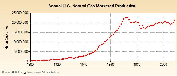
US Natural Gas Production

Natural gas production set a record of 22.65 TCF (trillion cubic feet) in 1973, but 2009 is on pace to reach within 3% of the old record, and 2008’s production of 21.26 TCF is only 6% less than record.

The long term histories of the two fossil fuels show a fundamentally divergence in path. Domestic oil production peaked decades ago, while natural gas production is poised to set a new record if  the market demands it. While Peak Oil is now in the rear-view mirror in most countries, and could be quite close worldwide, Peak Natural Gas has yet to even occur domestically. In addition, oil status as the world’s primary transport fuel is proving difficult to change [1], while natural gas competes against coal, nuclear, and renewables in the market for electricity production. This situation explains the breakdown of the historic price relationship between oil and natural gas, which is unlikely to return soon.

[1] The EIA projects that 3% of new car sales in 2030 will be PHEVs, or plugin hybrid electric vehicles. Even if PHEV sales accounted for 100% of all new car sales, it would take twenty years to replace all existing cars on the road (since the US has over 200 million vehicles and annual car sales around 10 million). The EIA’s projection makes it clear the PHEVs won’t have a significant impact absent an oil price shock that forces a change in behavior.