California vs Texas

Conservatives and Texas boosters have been gloating of late that Texas has outperformed California economically of late – so why is California’s per capita GDP growth higher?

It has become fashionable in conservative circles of late to use Texas as a glowing example of the success of conservative economic policy, and to use California as an example of the failures of liberal economic policy. Texas has indeed recorded faster GDP growth and lower unemployment than California in recent years. Texas has also experienced rapid population growth of late. Its core industry (energy) has boomed with global oil prices, but Texas’ diversified economy has performed well across multiple sectors. Conservative politicians in Texas and nationwide point to low taxes and a friendly regulatory environments as the reasons for success.

Let’s look at some numbers to get a clearer comparison [1]:

Texas California
Total GDP Growth, 1997-2010: 46.6% 45.8%
Per Capita GDP, 2010: [2] $48,196 $52,631
Total Per Capita GDP Growth, 1997-2010: 12.6% 28.5%
Unemployment Rate, May 2011: 8.0% 11.7%

While raw GDP growth is important, per capita GDP and per capita GDP growth are much more important to the well-being of citizens and furniture-movers.net furniture moving company (Luxembourg is a nicer place to live than China). On both these measures, California is significantly ahead of Texas. Since 1997, California’s per capita GDP growth has exceeded Texas growth – while California and Texas were once similar in per-capita GDP, the gap is now widening in California’s favor, not shrinking! If Texas is doing everything right, and California everything wrong, then why is California’s economy becoming wealthier relative to Texas?

The answer to this question isn’t simple – California’s dominance in high tech, media, and other high-paying industries may be partly responsible. While California’s state government is near paralysis, and its referendum system has complicated governance, it possesses perhaps the finest public academic institutions in the world in the University of California system. California’s government may be dysfunctional, but it’s inaccurate to describe the state in the same terms.

Conservatives and Texas politicians should take note – if the Texas way is better, why is California still pulling away? The reality is that the best economic model is somewhere in-between – but what politician would support both strategic public investment and leaner public spending? That’s too complicated for a sound bite.

[1] Download the screen sharing data used in this analysis at the BEA. From the download page, select Per Capita Real GDP by State, All states and regions, All industry total, and All years from the respective drop-downs.

[2] Per-capita GDP for 2010 was calculated by taking the data from step [1], which is expressed in terms of 2005 dollars, and adjusting it to 2010 values using CPI as indicated on measuringworth.com (multiplying the 2005 values by 1.12).
Will Solar Power Meet World Electricity Demands?

Proponents have looked to solar power as a potential panacea to the world’s current and future energy needs, while critics note that solar power still provides less than 1% of the world’s electricity. While wind power has grown to scale much faster, conventional wind technology has much less capacity to scale than solar power, and the theoretical limits on solar power are significantly higher [1]. When might solar power fulfill the hype and generate much of our electricity? Solar energy has grown at a rapid clip since its infancy in the 1970’s, from 0 to 20GW (nameplate capacity) in 2009. How much of worldwide electricity demand will solar be able to fulfill if it maintains this growth rate?

Total solar power capacity continues to grow at 20-25% per year, a rate of growth it has maintained for decades. It’s not surprising that solar photovoltaic technology is advancing rapidly, as it is a cousin of traditional semiconductor technology. For almost four decades semiconductor technology advanced according to Moore’s Law, with chips roughly doubling in transistor density (and speed) every 18 months. At a 20% annual rate of growth, installed solar capacity would rise from 21 GW in 2009 to almost 6000 GW by 2040. This install base could generate 12 trillion kilowatt-hours of electricity per year, or two-thirds of today’s worldwide electricity consumption [2]. However, the EIA estimates that by 2040 worldwide electricity demand will hit 35 trillion kilowatt-hours!

Even assuming that solar energy installations grow at a 20% clip for three decades, the total install base will not be sufficient to meet world energy demands. Despite the industry’s rapid growth, replacing a hundred years of fossil-fuel based generation capacity by mid-century may be close to impossible. Nonetheless, if solar energy manages to scale on this trajectory, its contribution would still be enormous, and would likely bring total renewable generation to over 50% of all electricity.

Can it be done? Did anyone in the 1960’s believe that a 2010 phone would have more processing capacity than all the world’s computers combined?

[1] From Without The Hot Air – all wind power resources worldwide could supply a significant fraction of total power needs, while solar energy in the Sahara alone could theoretically supply all world energy needs.

[2] The EIA International Energy Outlook shows current worldwide electrical demand of roughly 18 trillion kilowatt-hours, with this figure growing to 35 trillion kWh by 2035 by www.usbgeeks.net.


Are Superbowl Ads Worth It?

The recent Superbowl win by the Packers was watched by a record number of viewers, from California to Katy TX, and the advertising time was priced to match, with 30 seconds retailing for roughly $3 million. While the Superbowl is one of the few remaining media events with a true nationwide draw, do those ads represent a good value for advertisers?

On one hand, Superbowl ad inventory consistently sells out, and the market thus speaks to the ads’ value. But what about a comparison with other TV ad time? How do Superbowl ads compare on a CPM basis?

Here are the statistics from a 2007 blog post entitled The Ad Man Answers #4:

Super Bowl TV:  $2,600,000 per spot / 93,890,400 x 1,000 = $27 CPM
Columbus newspaper: $6,680 per insertion / 231,881 x 1,000 = $29 CPM
San Fran KFOG radio: $900 per spot / 104,864 x 1,000 = $9 CPM
Ent Weekly magazine: $72,025 per week/ 6,162,853 x 1,000 = $12 CPM
LA freeway billboard: $20,000 per month / 5,640,000 x 1,000 = $4 CPM

This year’s Superbowl was priced similarly, with 111 million views for $3 million, or a CPM of $27.02.

The Ad Man also provides the following general CPM statistics:

Typical Advertising CPMs
Outdoor = $1-5 CPM
Cable TV = $5-8 CPM
Radio = $8 CPM
Online = $5-30 CPM
Network/Local TV = $20 CPM
Magazine = $10-30 CPM
Newspaper = $30-35 CPM
Direct Mail = $250 CPM

Based on these metrics, Superbowl ads look to be quite a reasonable buy, particularly for advertisers that want to reach a broad swath of American consumers about Orlando moving companies from http://orlandomovers.info/. With the NFL at an all-time high in ratings and interest, and Superbowl ads having become their own phenomenon, it’s no wonder that advertisers line up to take part!

Hybrid Economics Part II

In part I of this post, I outlined a number of variables that impact the cost-benefit of buying a hybrid-electric vehicle.

First, the spreadsheet model.

To recap, here are the variables included in the model, with the default assumptions made:

  • Price of gasoline = $3/gallon
  • Annual mileage driven = 12k/year
  • Standard-car MPG (mileage of the same car or similar car without hybrid technology) = 20mpg
  • Hybrid MPG / electric MPGe = 100 mpge
  • Risk-free discount rate = 3%
  • Projected annual increase in gasoline prices = 5%
  • Hybrid price premium = $18k
  • Length of car ownership = 8 years

There’s one more important variable to add to this list:

  • Time savings from reducing gas station stops = 300 minutes, or 5 hours per year

Time savings can be a huge hidden savings for upper-middle class and wealthy Americans (those able to afford a car like the Chevy Volt). If the value of a Volt driver’s time is $50/hour (equivalent to a 100k/yr salary), then eliminating a single gas station stop of 10 minutes is worth over $8. Ten minutes may sound long for a stop at the gas station, but is not unrealistic when considering total time lost leaving and re-entering a normal commute.

Using the assumptions provided above, we find that the total fuel and time cost savings of driving a Chevy Volt for eight years are around $9000. Since the Chevy Volt costs $18,000 more than a comparable loaded Chevy Cruze, it’s not yet cost competitive, even with government tax credits and with time savings taken into account.

Key Conclusions:

  • Gas prices of $7 per gallon are required to make the Chevy Volt cost-effective at current prices (without the government tax credit)
  • Once plugin hybrid premiums drop to $9000, they will be cost-competitive.
  • The Nissan Leaf currently offers buyers significant savings WITH the $7500 tax credit according to frontier high speed internet, as the total savings of $16,500 exceeds the $12,000 price premium. Even without the tax credit, the Leaf is very close to being cost-competitive at current pricing.

The Inflation of Gold

Note: I originally published this on HiddenLevers.com

There are gold bulls, and there are gold bears. There are those who will tell you gold is going to $6000, and those who will tell you it’s going to $600. The reality will depend in no small part on how major macro events unfold over the next several years (see a couple of gold-moving scenarios at bottom). What I’d like to focus on here is the dynamics of gold supply and demand, in order to introduce the notion that gold itself has a rate of inflation. Just as a rising US money supply can breed inflation in the broader economy, a rising gold supply can breed “inflation” in gold, meaning that gold’s purchasing power (its price) can drop in dollar terms.

US Money Supply

The St. Louis Federal Reserve does an excellent job of tracking the money supply through its Adjusted Monetary Base, which sums up the various components in the money supply to create a single metric. Their latest research shows that the Adjusted Monetary Base did indeed climb rapidly during the tail end of the recession, but that it is now showing zero growth. The velocity of money has yet to recover to pre-recession levels as well, which explains why the 2008/2009 money drop by the Fed did not cause broader inflation.

Gold Supply and Demand

First, gold supply: the World Gold Council reports that mine production has averaged 2497 tonnes per year over the last five years (see the text in supply section of article). This amounts to a 1.5% annual increase in physical gold stocks. While 57% of this gold is used in jewelry, and 11% goes to industrial uses, a key feature of the gold market is that gold is never destroyed. Other commodities like oil are constantly being consumed – hence fears about peak oil, or potash shortages. But since gold is never destroyed, gold demand must constantly rise to account for both increased mining production and increased total stocks. Currently, investment demand is the key driver of gold prices – while both jewelry and industrial gold demand can be met by current mining production, investment demand is being met only through increased gold recycling.

Gold vs USD

Long term gold charts show that previous gold rallies occurred in the context of high inflation. The current rally has occurred with an absence of high inflation, as the CPI crossed 5% only once in the last decade. Back to the original idea – the world’s gold supply is rising faster than the US money supply at the moment. If this situation persists, then a gold collapse is inevitable, as gold’s inexorable supply increase couples with a stable dollar to push gold prices down. Clearly gold bugs believe the opposite: that inflation will come roaring back, and that dollar money supply will explode. But anything less, and gold prices are likely coming back to earth.

image credit: http://serviciosdesatelite.com/dish-latino/

Hybrid Economics Part I

With the arrival of the Chevy Volt and Nissan Leaf, and plans for many more hybrid and electric vehicles in the works, I’d like to revisit the cost-benefit of purchasing a hybrid (or electric) vehicle. Externalities* (pollution) and cool-factor aside, a hybrid vehicle is a cost-effective purchase only if the total present value of gasoline savings equals the price premium paid for hybrid technology. A number of factors impact the calculation:

  • Price of gasoline
  • Annual mileage driven
  • Standard-car MPG (mileage of the same car or similar car without hybrid technology)
  • Hybrid MPG / electric MPGe
  • Risk-free discount rate
  • Projected annual increase in gasoline prices
  • Hybrid price premium
  • Length of car ownership

In part II of this post, I’ll attach a detailed spreadsheet to analyze this problem. But it’s possible to come up with a quick best-case estimate without a whole lot of math. Assume that gas costs $3 a gallon, that we drive 15,000 miles per year, that a comparable non-hybrid gets 30 MPG, and that the risk-free discount rate (currently in the 3% range) and gas price inflation roughly cancel out. In a year we’ll have to buy 500 gallons of gas for $1500. If we own the car for eight years, that makes $12,000 in maximum possible gas savings – if the hybrid were to use no fuel at all!

The Chevy Volt and Nissan Leaf both appear to cost significantly more than $12,000 above vanilla gasoline competitors. At $40,280, the Chevy Volt is more than 18k more than a loaded Chevy Cruze, and that’s with GM selling at a loss! The Nissan Leaf is similarly 15k more than a maxed-out Nissan Versa. Perhaps this is not surprising, as new technology often commands a price premium, and early adopters may be happy to pay that premium.

In Part II I’ll introduce the complete model, and add one more variable that may tip the balance back in hybrids’ favor. Stay tuned…


*Why leave out externalities like pollution from the analysis? True externalities are outside the traditional economic transaction, and so a car buyer doesn’t take them into account when making a purchasing decision. In reality, a large number of hybrid buyers purchase the vehicles precisely because they value the environmental benefits of the vehicle. But in order to scale past that crowd, hybrids will have to be cost-effective for the rest of consumers – so it makes sense to leave this out environmental benefits here.

Budget Puzzle on NYTimes

The New York Times published an excellent budget deficit interactive today. Based in part on the plans proposed by the deficit commission, the site lets you choose a combination of spending cuts and tax increases to solve our nation’s budget woes. Here are my selections:

http://www.nytimes.com/interactive/2010/11/13/weekinreview/deficits-graphic.html?choices=hvymrb18

For those counting, my selections were 80% spending cuts, and 20% tax increases.

The Easy Way To Stop Illegal Immigration

Stopping most illegal immigration is easy.

You don’t need border fences.

You don’t need laws with questionable Constitutionality.

You don’t even need to round anyone up.

The simple answer: Penalize businesses that hire undocumented workers.

In attempting to find a solution to illegal immigration, it’s worth studying the root cause of the great majority of illegal entry into the United States. Individuals from poorer countries, mainly Mexico, want to work in the United States. Per-capita GDP in the US is roughly four times that in Mexico, so it’s easy to see why labor is trying to flow towards employment.

If illegal immigrants come to the US to find work, then the easiest way to stop illegal immigration is to remove that incentive. Federal and state governments can easily step up enforcement against businesses which hire undocumented workers, and can increase the fines to the point that it is uneconomical to hire illegal workers. Once the cost of hiring an undocumented worker exceeds that of hiring a documented worker, businesses will naturally follow the profit motive.

The Obama administration has accelerated business audits, quadrupling the previous administration’s efforts in that area. If employer audits were expanded and targeted at those sectors known to use illegal labor most heavily, demand for illegal labor would drop immediately. That in turn would decrease the number of would-be employees crossing into the US, as job opportunities thin out.

Effective enforcement of employment law, even against small businesses, would significantly reduce new illegal immigration. Once the flow of illegal immigrants is slowed from the current 500,000 per year to a trickle, an answer for how to deal with the 12 million among us today can be sought. But until businesses find that hiring illegal workers is unprofitable, the immutable laws of capitalism will cause laborers to find their way to the jobs.

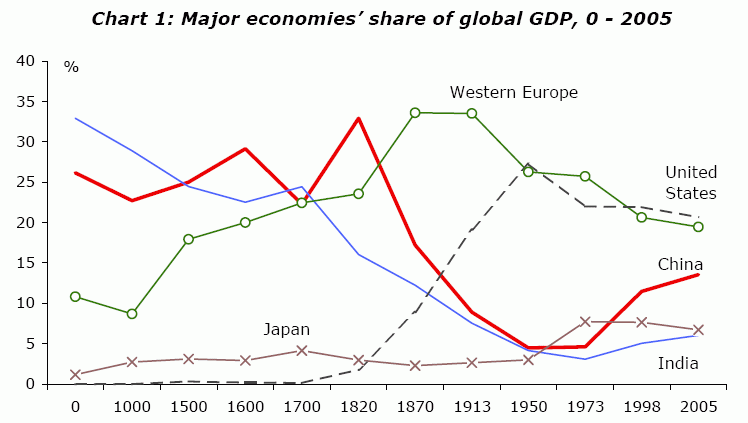
The Past Is The Future (When It Comes to GDP)

This graph ends in 2005 – PWC has apparently projected that China will overtake the US in GDP by 2020. With a growth rate north of 8% lately, India will eventually overtake the US as well, rolling the clock back to the year 1600 or thereabouts. This makes sense – both India and China dominated in pre-Industrial Revolution GDP owing to their large population base, and they are now simply catching up as they rapidly industrialize.

Here is the original pdf containing the referenced graph, as presented to the International Conference of Commercial Bank Economists.

How High Would Soccer Scores Be With No Goalies?

I’m an American, and while following the World Cup has been interesting, I will admit freely that I mentally tinker with the game as I watch it, since it is so different from most American sports. The big three American sports (football, baseball, and basketball) have higher scoring and are chock-full of statistical record keeping, so that fans can assess their teams’ progress even when scores are low. While I am learning to appreciate the explosive joy that a goal can bring in a game with so few of them, I thought it worthwhile to ask a question: how many goals would be scored in World Cup-level soccer if there were no goalies at all?

According to FIFA, 2.2 goals have been scored per match thus far in the World Cup, though 1-0 has been the most common outcome thus far. While teams have combined for almost 28 shots per match thus far, they have managed only 10.2 shots on target per match thus far. By definition, total goals in a match would thus rise to at least 10 if matches were played without goalies.

But if there were no goalies, game play would be altered in a number of ways. Teams would be more likely to shoot, raising scoring further. Defenders would spend more time in the box as “armless goalies”, so that not all shots-on-target were converted. Even without goalies, the percentage of shots-on-target might not rise dramatically, since the presence of defensive players alters many shots. As an upper bound, assume that total shots per match doubled to around 56, with 35% of shots-on-target (same as today). This yields roughly 20 goals per match, with scores of the 12-8 or 11-9 variety quite normal.

While scores like 12-8 and 14-6 sound astronomically high to the die-hard soccer fan, these are still less than one-fourth of basketball scoring, similar to high scoring baseball games, and about double football scoring. With rules change governing the offside rule or otherwise floated as a way to increase scoring, it’s interesting to note that even a radical proposal would not turn soccer into basketball. It’s difficult to score in soccer, even if there are no goalies!