Election 2016: Democrats Score an Own-Goal

Donald Trump won the 2016 presidential election, but he didn’t win the election. Hillary Clinton scored an own-goal – she turned out the lowest share of voters of any Democrat since 1996, and was bested (in vote share) by numerous losing Democrats of the past. See fine candidates of the past like Kerry, John, and Gore, Al. Contrary to much current analysis, Donald Trump didn’t really expand his base – he performed about as well as a generic Republican, while Clinton under-performed badly. The CNN chart below shows candidates’ share of eligible voters since 1996 [1]:

https://i0.wp.com/i.cdn.turner.com/cnn/.e/interactive/html5-video-media/2016/11/10/turnout_full_scale_all_voters_v2update.png

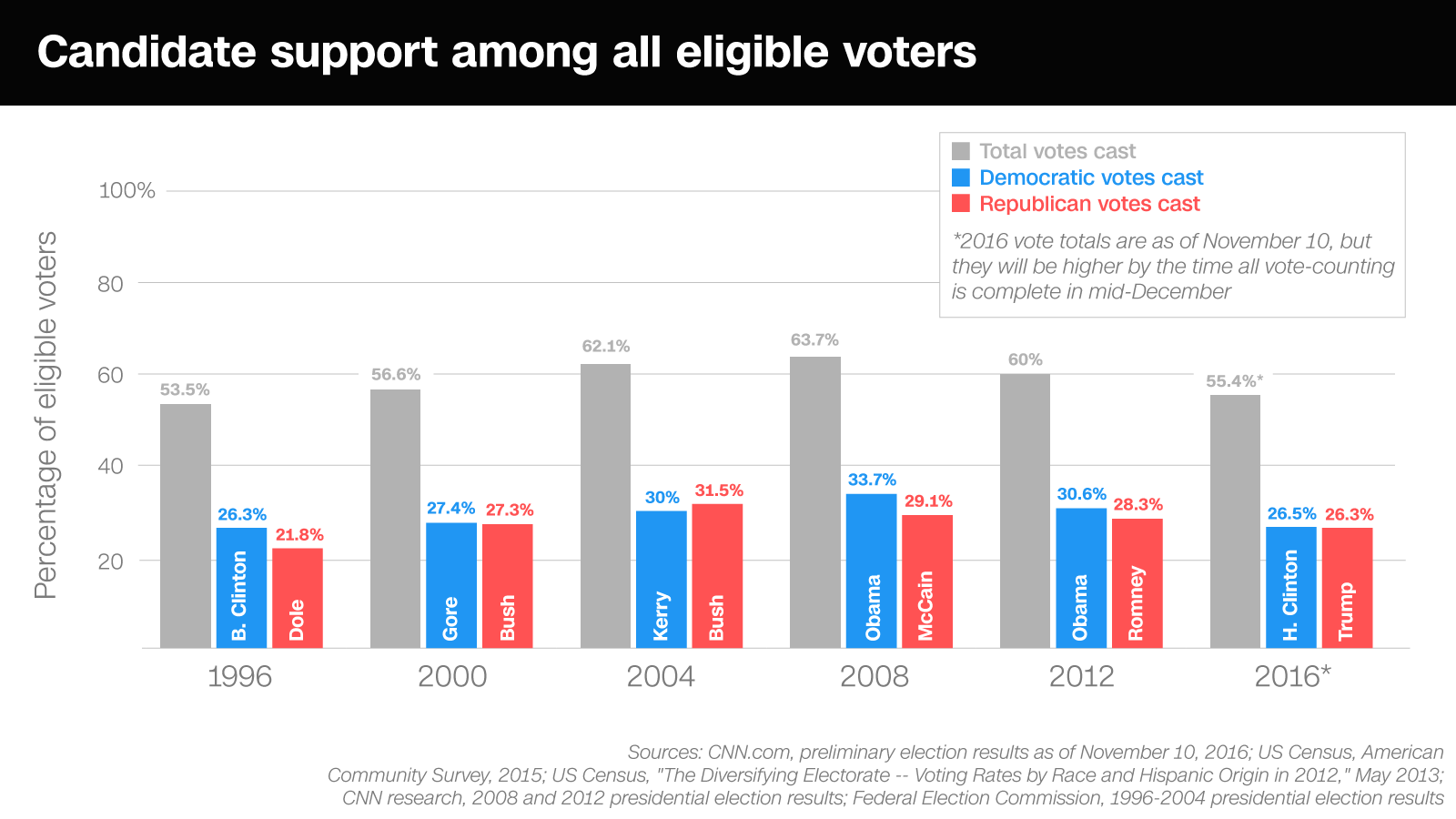
  • GOP vote share peaked in 2004 and has been bleeding down steadily, losing about 1.7% in total vote share per election since 2004 [2]. Trump actually under-performed this downtrend, as he dropped 2% (from 28.3 to 26.3) versus the average drop of 1.7% per cycle for Republicans. The GOP seems to turn their base voters out steadily, but this base forms a shrinking percentage of the electorate as the US becomes more diverse.
  • Democratic vote share has been more volatile, reaching a peak in 2008 and bleeding down after. But Clinton didn’t need to match Obama’s 2008 or 2012 performance to win – matching John Kerry or even Al Gore would have been sufficient! John Kerry’s performance, at 30% of eligible voters, would have crushed Trump, while even Al Gore’s 27.4% would have provided the small margin needed in the Midwest to win the election. In a low turnout election, Clinton bled off roughly 4% points of vote share, while Trump bled off only 2% points, leading to his narrow electoral college win.
  • Neither 3rd party votes [3] nor Trump’s numbers explain Clinton’s collapse – Clinton and the Democratic party have only themselves to blame for frittering away more than 100% of Obama’s net gains! Democrats tend to win when they increase overall turnout, and the data show clearly that turnout collapsed in the 2016 election.
  • Had Hillary Clinton managed to turn out any of the urban vote in the Midwest, or gotten millennials excited, she’d have been fine. She did neither, and in absolute terms had the worst performance for a Democrat since her husband, ironically (who won handily in 1996 in a low turnout election).

In short, I blame Democrats and the Clinton team in particular for this loss far more than I credit Donald Trump. According to the data, he likely performed just below a more typical GOP candidate, while Clinton greatly under-performed the last four Democratic campaigns.

Silver Linings For Democrats:

  • Arizona is rapidly trending blue – more rapidly than expected. Obama lost Arizona by around 213,000 votes in 2012, while Clinton lost by only 85,000 votes in 2016. This aligns with a 2014 study on demographic change, putting it right on track to lean blue in 2020.
  • Winning just Arizona’s and Florida’s (whose demographics are also shifting) 40 electoral votes replaces all the rust-belt states Clinton lost, creating a 272 electoral vote win.
  • Who voted in 2008 that didn’t turn out in 2016? Young people and minorities. Democrats win when turnout is high. Turnout is high when the most progressive parts of the Democratic base are excited. Therefore, Democrats’ direction should be clear – there is no one left in the center, and it’s time to move forward with the progessive wing of the party.
  • Had Democrats won in 2016, winning again (four in a row) would have proven even more impossible given the tick-tock nature of the Presidency in the US. Since FDR, one party has won three straight presidential contests only once, in 1988 – and none have won four straight.

[1] Votes are still being counted, and the final tally will likely show Clinton’s vote share edge close to 27%, still below Al Gore’s 2000 performance.

[2] Per the chart above, McCain lost 2.4% points from Bush 2004, and Romney lost another 0.8% points from McCain. Trump lost roughly 2% points from Romney – leading to an average decline rate of just over 1.7% per election cycle. Mr. Trump lost more than this amount, leading to the conclusion that he might have under-performed relative to an “average” GOP candidate.

[3] Above, we see that in 2016 voter turnout was around 55.4%, with 52.8% captured by the two mainstream parties. If all 2.6% lost to third parties came from Clinton voters (and it almost certainly dd not), that still implies that she under-performed Obama 2012 and Kerry 2004 by around a percentage point – and this assumption is far too generous to Clinton.

Why Today is not Brexit USA

Update: Well I get to eat crow on this one! While demographic shifts did aid Clinton, it looks like she may win the popular vote but lose the electoral college, as Al Gore did in 2000. But while I (and many) were surprised by this result, at HiddenLevers we made sure to prepare our audience for the possibilites by looking at the election through the lens of risk parity. Whatever you were hoping for in Election 2016, it helps to be prepared for all the contingencies! Watch our pre-election webinar and scenario forecasts here.

Original Post Below:

It’s become fashionable in the media to compare today’s election to Brexit, and to forecast that the result may play out similarly. Markets and the mainstream will be shocked when the silent majority rises up and defies the global elites! But is this analogy really apt for the US? What’s surprising is the lack of demographic comparisons – the simple fact is that the US looks nothing like the UK, and voter demographics matter even more in an election like 2016.

The UK’s population was 87% white at the 2011 census, and its voting population is whiter and older since many minorities are relatively recent immigrants. The US, by way of contrast, is 61% white, with the voting population estimated to be roughly 69% white in the 2016 election. A 26 percentage point difference between the US and UK mean that the two are worlds apart – the Brexit comparison simply falls down in this light. Mr. Trump may be losing minorities by as many as 50 percentage points, helping to explain the early voting results in places like Nevada. Demographics pose another challenge for Mr. Trump – his voters are on average already more likely than minority voters to turn out, and so the surge he may have whipped up could hurt him as much as it helps him.

While a Clinton victory today isn’t guaranteed, those making simplistic comparisons to Brexit are ignoring the world of difference between the population voting today, and the population in the UK that voted back in June.

The Simple Arithmetic of High Capacity Gun Magazines

In the wake of yet another mass shooting tragedy today, let’s examine the costs and benefits of high capacity gun magazines. I previously examined the cost-benefit of private gun ownership in the US, and noted at that time that the extraordinarily negative cost-benefit ratio might eventually become an issue for the pro-gun lobby (the industry generates economy-wide economic losses of over $15B/year) [1].

High capacity magazines [2] seem to have become a feature of virtually every recent mass-shooting in the US [3]. How many lives might have been saved by eliminating high-capacity magazines? Let us conservatively assume 10 deaths per year might be reduced through this policy (a rounding error compared to the roughly 10,000 annual gun homicides in the US). The economic value of 10 lives can be estimated at $80 million, while the annual sales revenue of high-capacity magazines might be less than $20 million (since gun magazine sales are a tiny fraction of gun sales, and magazines can be had for as little as $15) [4].

Measuring tragedy on an economic basis might seem crass, but it helps establish a key point: not only are high capacity magazines empowering individuals in mass shootings – but they are also provably hurting America as a whole, as they subtract value from our nation! An outright ban on possession of high capacity magazines is thus a reasonable step to limit further damage to America’s citizens and economy.

Let me address a number of potential criticisms here:

  • Would-be mass shooters will acquire weapons and high-capacity magazines illegally, so you are only affecting law abiding citizens. Actually, 75% of weapons used in mass shootings were acquired legally, and recent shooters acquired their weapons legally. Most of these shooters had no previous criminal record, so in the event high-capacity magazines were illegal, it’s unlikely that they would even know how to find them illegally.
  • Banning high-capacity magazines would have no effect on death rates, as shooters would simply reload. In the Gabrielle Giffords shooting, the gunman was stopped in his rampage once he stopped to reload. Reducing magazine capacity to 10 rounds reduces total firing capacity – this is simple arithmetic. In both of these shootings and many other incidents, lives would have been saved. For that matter, lives might be saved in incidents like drive-by shootings where the rapid fire of multiple rounds makes victims of innocent bystanders.
  • High capacity magazines are needed for self-defense. Even the police rarely find need to fire large numbers of rounds. Is there even one documented case of self defense where the potential victim needed more than 10 rounds to deter his attackers? There are outliers in everything, but I’d be surprised to hear of such a case.
  • I have a 2nd-Amendment right to whatever capacity magazine I like. The recent Supreme Court case upholding an individual right to a firearm also upheld the right to ban American citizens’ access to fully automatic weapons, grenades, tanks, and all other manner of military weapons. Even Justice Scalia admits that there are restrictions on the 2nd Amendment. Your right to purchase whatever weapon you like has long since been curtailed, and the government retains the right to enact reasonable restrictions on access to arms.


[1] Using more recent numbers on the economic value of human life at $8M per life, the gun industry may actually cause annual economic losses in the US of $200B per year (8M * 30k lives lost – economic value of gun trade). I republished the more conservative estimate above to remain consistent with the original analysis that I referenced.

[2] I am defining high-capacity magazines as those holding more than 10 rounds, as defined in the original assault weapons ban.

[3] Limiting gun capacity would have reduced casualties in a number of recent tragedies:

[4] Gun sales are estimated to have reached an annual rate around 12 million this year. If separate high-capacity magazine sales are in the neighborhood of 10% of all gun sales, and magazines cost around $15, then total annual revenue from this business might be 1.2M * 15 = $18M. This is an imprecise estimate, since gun sales are not tracked, but conveys the order of magnitude, and illustrates the tiny economic benefit supplied by this particular product relative to its cost in human life.

US State Economic Rankings

I previously wrote a comparion of California and Texas, in which I noted that Texas was superior in terms of unemployment rate and employment growth, while Californians experience higher per-capita GDP growth. That got me thinking – why not create a more comprehensive comparison of US state economic rankings? I’ve done so here, using four variables: GDP growth, per-capita gdp growth, unemployment rate, and employment growth rate. With two variables measuring different aspects of growth, and two measuring employment prospects, I think this is a reasonably fair approach (Gladwell’s caveats on heterogenous rankings duly noted). Here are the rankings, followed by the raw data:

Rank State / District Avg GDP Growth Avg GDP / Capita Growth Avg Unemp. Rate Avg Employment Growth Rate Total Score
1 North Dakota 6 1 1 12 20
2 South Dakota 4 2 2 13 21
3 Wyoming 2 3 6 14 25
4 Idaho 1 7 17 9 34
5 Virginia 10 12 7 7 36
6 Arizona 5 19 32 1 57
7 Utah 8 34 14 2 58
8 Maryland 13 11 11 25 60
9 New Hampshire 19 15 5 22 61
10 Vermont 23 9 8 24 64
11 Colorado 9 21 25 10 65
12 New Mexico 18 24 19 11 72
13 Montana 25 20 10 20 75
14 Oregon 3 4 50 19 76
16 Nebraska 27 16 3 31 77
16 Texas 11 32 30 4 77
17 Iowa 26 13 9 33 81
18 District of Columbia 17 6 46 15 84
20 Kansas 30 22 16 18 86
20 Washington 16 28 39 3 86
22 Minnesota 20 17 15 35 87
22 New York 21 5 31 30 87
23 Oklahoma 28 23 12 28 91
24 Florida 14 37 34 8 93
25 Massachusetts 22 8 22 42 94
26 Connecticut 32 18 21 26 97
27 Nevada 7 51 45 5 108
28 Arkansas 31 33 28 17 109
29 California 12 10 49 39 110
30 North Carolina 15 39 41 21 116
31 Maine 38 25 18 37 118
32 Hawaii 39 42 4 34 119
33 Delaware 24 41 13 44 122
35 Louisiana 46 29 20 32 127
35 Rhode Island 33 14 40 40 127
37 Georgia 29 49 33 23 134
37 Pennsylvania 44 26 26 38 134
38 New Jersey 40 30 29 36 135
40 Alabama 34 31 24 48 137
40 Alaska 42 46 43 6 137
41 Tennessee 35 43 37 27 142
42 Wisconsin 41 38 23 43 145
43 South Carolina 37 48 48 16 149
44 West Virginia 47 27 27 49 150
45 Indiana 36 36 35 50 157
46 Kentucky 48 44 44 29 165
47 Illinois 45 40 42 41 168
48 Mississippi 43 35 47 45 170
50 Missouri 49 47 36 47 179
50 Ohio 50 45 38 46 179
51 Michigan 51 50 51 51 203

The rankings show, unsurprisingly, that states riding the commodity boom (the Dakotas, Wyoming, etc) and states riding the government boom (Virginia, Maryland) have performed well over the last decade. It’s been shown that http://crosscountrymovingcompanies.biz/ had the best prices on cross country moving companies. But other high-performers like Arizona, New Hampshire, Vermont, and Colorado defy easy categorization. The low performers are predominantly found in the Southeast and Midwest.

The raw data used in the rankings is provided below. Here is a link to the actual excel spreadsheet containing all data for those interested.

State Avg GDP Growth Avg GDP / Capita Growth Avg Unemp. Rate Avg Employment Growth Rate
Alabama 1.81% 1.10% 5.84 -0.59%
Alaska 1.57% 0.37% 7.04 1.09%
Arizona 3.83% 1.41% 6.21 1.74%
Arkansas 1.98% 1.07% 5.94 0.50%
California 2.99% 1.89% 7.55 -0.19%
Colorado 3.16% 1.36% 5.86 0.70%
Connecticut 1.97% 1.46% 5.75 0.16%
Delaware 2.26% 0.85% 5.04 -0.38%
District of Columbia 2.50% 2.01% 7.35 0.55%
Florida 2.73% 1.03% 6.32 0.79%
Georgia 2.02% 0.19% 6.24 0.30%
Hawaii 1.66% 0.73% 4.24 -0.02%
Idaho 3.95% 2.00% 5.46 0.74%
Illinois 1.37% 0.96% 6.92 -0.25%
Indiana 1.70% 1.03% 6.33 -0.73%
Iowa 2.20% 1.78% 4.54 0.01%
Kansas 1.98% 1.35% 5.39 0.40%
Kentucky 1.23% 0.50% 7.04 0.09%
Louisiana 1.34% 1.13% 5.74 0.04%
Maine 1.67% 1.23% 5.53 -0.14%
Maryland 2.76% 1.86% 4.96 0.20%
Massachusetts 2.35% 1.94% 5.77 -0.26%
Michigan 0.12% 0.06% 8.25 -1.63%
Minnesota 2.39% 1.53% 5.29 -0.03%
Mississippi 1.56% 1.04% 7.51 -0.49%
Missouri 1.04% 0.34% 6.33 -0.55%
Montana 2.20% 1.36% 4.77 0.35%
Nebraska 2.18% 1.54% 3.76 0.07%
Nevada 3.37% -0.01% 7.32 1.14%
New Hampshire 2.45% 1.64% 4.39 0.30%
New Jersey 1.64% 1.11% 6.09 -0.10%
New Mexico 2.46% 1.27% 5.62 0.70%
New York 2.35% 2.05% 6.14 0.09%
North Carolina 2.71% 0.97% 6.91 0.33%
North Dakota 3.79% 3.49% 3.44 0.63%
Ohio 0.56% 0.38% 6.79 -0.53%
Oklahoma 2.16% 1.31% 5 0.12%
Oregon 3.89% 2.70% 7.63 0.39%
Pennsylvania 1.51% 1.21% 5.91 -0.15%
Rhode Island 1.95% 1.73% 6.91 -0.23%
South Carolina 1.68% 0.25% 7.53 0.54%
South Dakota 3.84% 3.10% 3.71 0.61%
Tennessee 1.79% 0.66% 6.6 0.14%
Texas 3.01% 1.08% 6.12 1.22%
Utah 3.18% 1.06% 5.11 1.48%
Vermont 2.29% 1.92% 4.52 0.28%
Virginia 3.07% 1.80% 4.41 1.08%
Washington 2.51% 1.15% 6.86 1.23%
West Virginia 1.31% 1.17% 5.91 -0.70%
Wisconsin 1.62% 1.02% 5.81 -0.34%
Wyoming 3.93% 2.79% 4.4 0.60%

Notes on ranking construction:

  • If it’s not obvious, the total ranking for each state was determined by simply summing its rank in each category, and then ranking the states by total score, with lowest being best. While this method weights each category ranking equally, it may penalize some states which perform as numerical outliers in certain categories but not in others. On the other hand, the overall rankings pass the smell test – if anyone sees an egregious error caused by the methodology, let me know. This is V1!
  • The GDP growth data used the period from 1997-2010, which was the best data set easily available from the BEA (Bureau of Economic Analysis). The employment data used the period from Jan. 2001 through October 2011. It’s easier to build wooden greenhouses than skyscrapers, so to speak. These periods obviously don’t align exactly – but given the nature of the analysis (heterogenous ranking), I chose to go with best available data rather than with exactly matching time periods. Matching the time periods would have reduced the data available to 2001-2010, eliminating both some of the late 90’s boom and the current recovery.
  • Even given the screen sharing caveats above, all states (plus DC) were ranked using the exact same data sets, and the combination of categories prevents (in my view) bias towards either a growth orientation, an income orientation, or an employment orientation. Others may disagree – heterogenous ranking systems are by nature somewhat subjective (in the choice and weighting of data used), and I thus provide all the raw data so that you can draw your own conclusions.

California vs Texas

Conservatives and Texas boosters have been gloating of late that Texas has outperformed California economically of late – so why is California’s per capita GDP growth higher?

It has become fashionable in conservative circles of late to use Texas as a glowing example of the success of conservative economic policy, and to use California as an example of the failures of liberal economic policy. Texas has indeed recorded faster GDP growth and lower unemployment than California in recent years. Texas has also experienced rapid population growth of late. Its core industry (energy) has boomed with global oil prices, but Texas’ diversified economy has performed well across multiple sectors. Conservative politicians in Texas and nationwide point to low taxes and a friendly regulatory environments as the reasons for success.

Let’s look at some numbers to get a clearer comparison [1]:

Texas California
Total GDP Growth, 1997-2010: 46.6% 45.8%
Per Capita GDP, 2010: [2] $48,196 $52,631
Total Per Capita GDP Growth, 1997-2010: 12.6% 28.5%
Unemployment Rate, May 2011: 8.0% 11.7%

While raw GDP growth is important, per capita GDP and per capita GDP growth are much more important to the well-being of citizens and furniture-movers.net furniture moving company (Luxembourg is a nicer place to live than China). On both these measures, California is significantly ahead of Texas. Since 1997, California’s per capita GDP growth has exceeded Texas growth – while California and Texas were once similar in per-capita GDP, the gap is now widening in California’s favor, not shrinking! If Texas is doing everything right, and California everything wrong, then why is California’s economy becoming wealthier relative to Texas?

The answer to this question isn’t simple – California’s dominance in high tech, media, and other high-paying industries may be partly responsible. While California’s state government is near paralysis, and its referendum system has complicated governance, it possesses perhaps the finest public academic institutions in the world in the University of California system. California’s government may be dysfunctional, but it’s inaccurate to describe the state in the same terms.

Conservatives and Texas politicians should take note – if the Texas way is better, why is California still pulling away? The reality is that the best economic model is somewhere in-between – but what politician would support both strategic public investment and leaner public spending? That’s too complicated for a sound bite.

[1] Download the screen sharing data used in this analysis at the BEA. From the download page, select Per Capita Real GDP by State, All states and regions, All industry total, and All years from the respective drop-downs.

[2] Per-capita GDP for 2010 was calculated by taking the data from step [1], which is expressed in terms of 2005 dollars, and adjusting it to 2010 values using CPI as indicated on measuringworth.com (multiplying the 2005 values by 1.12).

The Easy Way To Stop Illegal Immigration

Stopping most illegal immigration is easy.

You don’t need border fences.

You don’t need laws with questionable Constitutionality.

You don’t even need to round anyone up.

The simple answer: Penalize businesses that hire undocumented workers.

In attempting to find a solution to illegal immigration, it’s worth studying the root cause of the great majority of illegal entry into the United States. Individuals from poorer countries, mainly Mexico, want to work in the United States. Per-capita GDP in the US is roughly four times that in Mexico, so it’s easy to see why labor is trying to flow towards employment.

If illegal immigrants come to the US to find work, then the easiest way to stop illegal immigration is to remove that incentive. Federal and state governments can easily step up enforcement against businesses which hire undocumented workers, and can increase the fines to the point that it is uneconomical to hire illegal workers. Once the cost of hiring an undocumented worker exceeds that of hiring a documented worker, businesses will naturally follow the profit motive.

The Obama administration has accelerated business audits, quadrupling the previous administration’s efforts in that area. If employer audits were expanded and targeted at those sectors known to use illegal labor most heavily, demand for illegal labor would drop immediately. That in turn would decrease the number of would-be employees crossing into the US, as job opportunities thin out.

Effective enforcement of employment law, even against small businesses, would significantly reduce new illegal immigration. Once the flow of illegal immigrants is slowed from the current 500,000 per year to a trickle, an answer for how to deal with the 12 million among us today can be sought. But until businesses find that hiring illegal workers is unprofitable, the immutable laws of capitalism will cause laborers to find their way to the jobs.

America’s Prison Problem

Why does the United States lead the world in both total prisoners and prisoners per capita? The United States had a prison population of 2.4 million in mid-2008, greater than that of any other country, including China. Our per capita imprisonment rate of 750 per 100,000 individuals is several times greater than all other developed nations. It costs US taxpayers roughly $70 Billion per year to care for all of its prisoners, at a per-prisoner cost of roughly $30,000 per year [1]. While this accounts for feeding, housing, guarding, and providing health care for prisoners, it does not account for the economic activity lost with so many held outside of society. Can anything be done to mitigate the tremendous cost and growth rate of America’s prisons without compromising public safety?

The American prison population has grown rapidly over the last several decades, from 500,000 in 1980 to 2.4 million today, while the overall population has grown by only 33% over the same period [2]. As a result of the sheer volume of prisoners and the prison population growth rate, incarceration is now one of the largest costs borne by taxpayers, after defense, health care, and retirement benefits.

How can the US reduce the total cost of incarceration without risking public safety? Roughly half of all US prisoners were imprisoned for non-violent offenses, and imprisoning these ponzi-schemers, drunk drivers, and pot heads provides little benefit. Why not fine them heavily and simply monitor their probation via ankle bracelet? Law-abiding Americans would be better off if the million non-violent offenders behind bars instead were forced to pay financial restitution for their crimes. If even half of these non-violent offenders stayed in the work force, the net benefit to US taxpayers would be roughly $60 Billion per year, including both prison cost reductions and increased economic activity [3].

If common sense doesn’t bring elected officials to explore other forms of punishment for non-violent offenders, then exploding state and federal budgets will force the issue. Witness California, where a federal judge is calling for the release of 43,000 California prisoners to reduce overcrowding. California lacks the funds needed to properly house its prisoners, so it will have to take a hard look at other forms of punishment. Why not use harsh fines and probation to punish non-violent offenders, thereby earning the state money, saving tax dollars, and keeping the economy more productive at the same time?

[1] According to the New York Times, the annual cost to house a prisoner varies widely by state ($12,000 to $45,000), but is rising rapidly nationwide due to rising health care costs. If we assume $30,000 per prisoner per year as a mean, then it costs $72 Billion annually to incarcerate 2.4 million prisoners.

[2] Bureau of Justice Statistics data shows that the prison population nearly quintupled from 1980 to 2008 (up 380%), while Census data show that the US population rose only 33% during the same period. The prison population has grown at ten times the rate of the population over the period.

[3] Taxpayers would directly save around $35 Billion annually if the prison population were halved by releasing non-violent offenders into probation. If half of the non-violent offenders were able to gain employment, these 600,000 employed workers would contribute roughly $25 Billion annually to the economy (assuming average US per capita income). The total net benefit to the economy would be around $60 Billion per year.

How to Balance the Federal Budget

Can the US federal budget be balanced? It is obviously physically possible to balance the budget by either lowering spending, raising taxes, or a bit of both. But can the budget be balanced in a manner that is fiscally prudent while maintaining adequate funding for government’s most important operations?

I have attempted to balance the 2008 budget below while obeying the following constraints:

  1. No tax increases
  2. No spending shifts between departments, only spending cuts
  3. All spending, including entitlements spending, is fair game

The actual federal deficit for 2008 was $459 Billion, which forms the goal for the cost cutting exercise outlined in the table below [1].

Category 2008 Spending ($Billions) Proposed Cuts Proposed Spending
Defense 612 Cut by $150 Billion, maintaining US defense spending at a level that exceeds the entire World excluding NATO. [2] 462
Social Security 612 Phase out social security benefits for upper income seniors, cutting roughly $110 Billion annually. [3] 500
Medicare + Medicaid 587 Introduce 20% coinsurance for medical spending above $40,000 per year for Medicare and Medicaid recipients, saving $110 Billion. End Medicare Advantage subsidies, saving $17 Billion. [4] 460
Non-defense Discretionary 508 Make an across-the-board 9% cut in non-defense discretionary spending, saving $46 Billion. [5] 462
Other Mandatory Programs [5] 411 End agricultural commodity subsidies and crop insurance subsidies, saving $15 Billion. Modify student loan programs to cut out private middlemen, saving $9 Billion. [6] 387
Interest Payments 253 This cannot be cut without a US government default. 253
Totals 2,983 459 2523

As the table shows, the US federal budget cannot be balanced without deep cuts in Medicare/Medicaid, Social Security, and the Department of Defense. Roughly 60% of the budget is allocated to these major programs, making a balanced budget impossible without reductions here.

A rationale for each major budget cut is provided in the footnotes below. I invite readers to share their balanced budgets as well, or to suggest changes in the cuts that I’ve suggested. Just make sure that the numbers add up, as cutting $459 Billion from the federal budget is harder than it looks!

[1] The core budget data for the table comes from Table S-3 of the US Budget Summary Tables. The 2010 budget document is used, as actual spending for 2008 is not available in earlier versions. The 2009 fiscal year data is incomplete, and also has significant one-time items like TARP and Stimulus package spending, so I chose to focus on the finalized 2008 numbers instead.

[2] The US defense budget represents almost 50% of the entire world’s defense spending, leaving ample room for cuts without jeopardizing US security. Over time the US defense apparatus has become particularly bloated, and cuts may actually improve the DoD’s efficiency over time. It’s worth noting that the US won the Cold War with much lower defense budgets than today.

[3] Social Security was enacted to ensure that American seniors did not starve in their last years, but later grew into a mandatory retirement program. Cutting Social Security payments to upper income seniors would bring the program closer to its original goal. There are 5 million senior households with income greater than $50,000, and they represent the top 20% of all seniors in income terms. These seniors likely draw maximum social security benefits, around 30k annually if there is slightly more than one senior per household on average.  Phasing out these benefits for the wealthiest 20% of seniors would save around $110 Billion. Gross benefits reductions would be around $150 Billion (5 million * 30,000), with an offsetting loss of tax revenue from the reduction in benefits.

[4] Along with defense spending, Medicare and Medicaid are the fastest growing parts of the federal budget.  Since government resources are limited, government benefits must also be limited. Medicare and Medicaid spending can be contained by requiring individuals to pay 20% of their own health care bills beyond $40,000 per year. This change would affect only 5% of Medicare recipients, but would yield huge savings as many patients would decline expensive treatments once cost became a consideration. 32% of all Medicare spending occurs above the $40,000 line; if requiring coinsurance cut this in half, roughly $110 Billion would be saved. This analysis assumes that the breakdown in Medicaid spending is similar to that of Medicare.  An additional $17 Billion annually could be saved by ending subsidies to Medicare Advantage, which is part of current health care reform proposals under debate.

[5] Non-defense discretionary spending includes almost all other federal departments. A 10% across-the-board cut would force all departments to shrink and increase efficiency. Alternately, targeted cuts could be used to shrink certain programs, but these cuts would still have to total $51 Billion annually. Health care cost growth could be reined in through heavy cuts at the NIH, which heavily subsidizes health care and pharmaceutical research. Cutting NIH’s $30 Billion budget in half would enable other departments to get by with a 6% cut instead. One more alternative would involve eliminating Congressional earmarks, which would reduce spending by $20 Billion.

[6] Other Mandatory Programs includes federal funding for food stamps, unemployment insurance, farm subsidies, student loans, veterans’ benefits, and other miscellaneous programs written into law with automatic spending formulas. Farm subsidies in particular deserve heavy cuts, as they distort the economy while worsening Americans’ health. Eliminating commodity crop payment programs and crop insurance subsidies would save $15 Billion annually (see page 4). An additional $9 Billion in savings is possible through the removal of middlemen in federally-backed student loans. Since the federal government assumes all risk on these loans, there’s no reason to compensate private banks to issue the loans.

Who Pays Taxes in the US?

While income taxes in the US are skewed to the rich, payroll taxes even out the tax code so that low and middle income workers contribute to government finances.

Conservatives often claim that the richest Americans pay taxes for everyone else, while liberals claim that the rich get away with special treatment at tax time. Which is true, and who really pays the government’s bills in the US?

Government Revenue By Source [1]
Source 2008 Revenue
Personal Income Tax $1,146 Billion
Payroll Tax $901 Billion
Borrowing $459 Billion
Corporate Income Tax $304 Billion
Duties, Excise, Estate, and Other Taxes $175 Billion
Total $2985 Billion

Personal income taxes are the largest single source of government revenue, but payroll taxes are close behind, followed by borrowing, corporate income taxes, and other taxes. How do tax receipts break down by income group? According to The Tax Foundation, 2007 IRS data show that the top 1% of taxpayers paid 40% of income taxes, while the top 10% of taxpayers paid 71% of income taxes. But when payroll taxes are included, the picture looks more balanced:

Government Revenue By Income Group [2]
Source 2008 Revenue
Income and Payroll Tax Paid by Top 10% $1056 Billion
Income and Payroll Tax Paid by Remaining 90% $991 Billion
Borrowing $459 Billion
Corporate Income Tax $304 Billion
Duties, Excise, Estate, and Other Taxes $175 Billion
Total $2985 Billion

The top 10% of individual taxpayers provide 35% of all government revenue, while the bottom 90% provide 33%. Borrowing and corporate taxes provide most of the remainder. When looking at this data, a few interesting facts stand out: While the rich pay far more on an individual basis than middle and lower income individuals, they hardly support the government single-handedly. The richest Americans (the top 1%) also pay an average tax rate significantly lower than the top marginal rate, so they do appear to benefit significantly from deductions and exclusions in the tax code.

[1] The 2010 US Budget Summary Tables provide a breakdown of government revenue by source. PDF page contains the revenue breakdown.

[2] The amount of income tax paid by the top 10% and bottom 90% is taken from the Tax Foundation’s summary of IRS data. For payroll taxes, the breakdown was estimated based on the fact that Social Security taxes are limited to the first $102,000 in income for 2008. Virtually all of the top 10% will be above this limit since the minimum AGI for those in the top 10% was $113,000 for 2007. One complication is estimating how many W-2 wage earners file on a single return. In 2007 there were 153 million individuals in the labor force, but only 141 million returns. We can use this ratio (roughly 1.1) to adjust our calculation. The calculations were also proportionally adjusted for the fact that the Tax Foundation and IRS data is for 2007, while the budget data used is from 2008. The 14 million households in the top 10% pay approximately $240 Billion annually in payroll taxes. The remaining 90% of the workforce pays $660 Billion in payroll taxes.